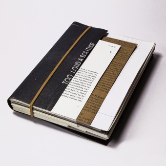
Too Loud A Solitude Book by Li-Ting Wang |
Home > Winners > #37875 |
 |
|
||||
| DESIGN DETAILS | |||||
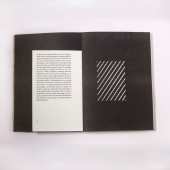
| DESIGN NAME: Too Loud A Solitude PRIMARY FUNCTION: Book INSPIRATION: In a modern life, which is full of visual and auditory sensation, the younger generation has a lower acceptance of reading text-based books than previous generations. When I looked for inspiration for my project I found that those books or magazines which had more visual elements attracted people more. By contrast, those that had merely text or less graphic images were easier to be ignored. I feel it is a shame that a book with good content never has a chance to be opened and read. In recent years, some writers or designers have been trying to introduce visual elements into the text of fictions - such as photography, typography, illustration etc. And the phenomenon has proved that there are still some possibilities with unconventional novels. Therefore, I began to think that a book is composed of not only the cover and the pages but also the spine, fore-edge and the binding etc. It is a three-dimensional object and so, if all the elements that make up a book are taken into consideration when doing a book design for a novel, is it possible to achieve better results? UNIQUE PROPERTIES / PROJECT DESCRIPTION: The design is based on a short novel by a Czech novelist Bohumil Hrabal. In my project the way of telling the story is by using different formats. Thus, the formats within the pages would change to follow the content. For example, In order to convey a feeling of heaviness and solitude in the main character's inner soul, cement was chosen for the outlook. The background of the story is a wastepaper factory, so that a wide range of paper was used to mimic the real wastepaper and trying to make a reader easily to imagine a pile of wastepaper at the very beginning. Through changing the size and texture and image the intention is to disturb the readers, and to create the feeling of anxiety and irritability. Beside, different shapes of rectangular holes were die-cut on black papers to represent the conversion of different space. Moreover, the hallucination was presented by printing the text on tracing paper. And by cutting out the words ‘book’ and ‘ books’ to represent the devastation of knowledge. OPERATION / FLOW / INTERACTION: It is a design for physical book only. I intent to make readers to feel the differences of the material, to see the change of the shape and to interact with the pages. PROJECT DURATION AND LOCATION: The project started in Sep 2014 and finished in Nov 2014 in London, and was exhibited in Dec 2014. |
PRODUCTION / REALIZATION TECHNOLOGY: Die-cut technique, RISO printing on the cover, Cement, Acrylic. SPECIFICATIONS / TECHNICAL PROPERTIES: The package: cement box 26.5x18x6 cm, acrylic cover 21x14.8 cm The book: 20 x14 cm TAGS: Format, Novel, Book design RESEARCH ABSTRACT: - CHALLENGE: Some challenges I faced during conducting this project were that, firstly, there are technical restrictions. For a project based on the formats, printing is not only the issue I have to consider. I need to treat it like a little structure. In order to find out more possibilities about a book format, I have undertaken many experiments. I found that, sometimes, a better format to present content is complicated and costly or needs to be done through a lot of handicraft. If taking printing technique into consideration, there were many restrictions in front of me. How to play with formats by using existing printing techniques is what I need to tackle. Moreover, there will always be some people who question about the interruption that occurs by the use of unusual formats when reading. However, as Safran Foer, a writer, states “Literature has been more protective of its borders than any other art form – too protective”. The form of the novel has not changed significantly over the centuries since the first novel was published in the world. It is hard to tell whether this is because readers prefer the format that we see today and therefore they can easily immerse themselves in the contents, or because readers easily lose themselves entirely in this format and thus publishers tend to follow the rules, resulting in the similar format of novels. Personally, because the literature is too protective, I believe there still is a lot of possibilities that can be explored in the ways of reading a novel. ADDED DATE: 2014-12-07 23:40:09 TEAM MEMBERS (1) : IMAGE CREDITS: Li-Ting Wang, 2014. |
||||
| Visit the following page to learn more: http://cargocollective.com/litingwang/ | |||||
| AWARD DETAILS | |
 |
Too Loud a Solitude Book by Li-Ting Wang is Winner in Print and Published Media Design Category, 2014 - 2015.· Read the interview with designer Li-Ting Wang for design Too Loud A Solitude here.· Press Members: Login or Register to request an exclusive interview with Li-Ting Wang. · Click here to register inorder to view the profile and other works by Li-Ting Wang. |
| SOCIAL |
| + Add to Likes / Favorites | Send to My Email | Comment | Testimonials | View Press-Release | Press Kit |
Did you like Li-Ting Wang's Print Design?
You will most likely enjoy other award winning print design as well.
Click here to view more Award Winning Print Design.


