Line User interface by R&D 64 |
Home > Winners > #37187 |
 |
|
||||
| DESIGN DETAILS | |||||
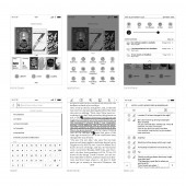
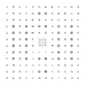
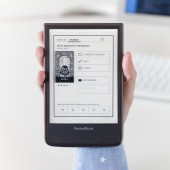
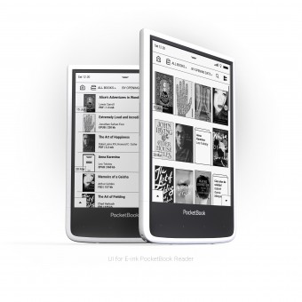
| DESIGN NAME: Line PRIMARY FUNCTION: User interface INSPIRATION: We love to read and we wanted to create a simple, convenient and appealing reading experience to readers everywhere. UNIQUE PROPERTIES / PROJECT DESCRIPTION: User interface provides a great user experience concentrating on reading books not interaction with interface. Clarity of the interface is achieved using thin outlines, intuitive and originally designed icons. OPERATION / FLOW / INTERACTION: Home screen allows user to open recently opened/added books, two of the most common scenarios. From recently added books on the home screen, a user can go directly to the list of recently added books -bundled by date- in the library. From applications panel at the bottom of the screen, a user may open one of 20 applications. Control panel at the top is available in all screens of the interface, so users can swiftly use important reader functions and cloud and social networks notifications. Whilst reading a book, a user can access a magnitude of useful set of tools in one touch. PROJECT DURATION AND LOCATION: The project started in Kiev from December 2013 till May 2014. |
PRODUCTION / REALIZATION TECHNOLOGY: First stage started with pencil prototypes based on technical requirements. After which animated mockups were created to check interaction, flow, and different user case scenarios. We did some modifications to the interface aiming at a faster, more responsive and seamless experience. A graphic design stage started by the time our design team were establishing graphical solutions to best fit E Ink screen. Our Graphical design was created in graphic editors, having contemporary design trends in mind, using minimalistic designs and omitting any overwhelming surplus details. SPECIFICATIONS / TECHNICAL PROPERTIES: This interface was designed for use with E Ink displays; therefore the interface is monochrome (16 grey levels). Fitted for a 6 inch 6" E Ink Carta™ display, with a resolution of 1024 x 758 pixels, and 212 dpi. TAGS: GUI, PocketBook, e-reader, user interface, E Ink, UX, user experience, minimalism, graphic design, monochrome RESEARCH ABSTRACT: The new user interface for PocketBook e-readers is the product of a two year analysis of user experience and takes into a consideration all business requirements as well as modern trends of graphical design, all in the context of making the most rewarding experience with E Ink display technology’s advantages and limitations. CHALLENGE: Below are some E Ink technology challenges: 1. Slow Screen Refresh Rate – The effective display refresh rate varies according to the waveform used. Therefore the screen takes around 300ms to update black and white colors while greyscale update takes around 600ms. 2. Ghosting and Flashing Effect – Depending on the update mode, a ghost image of the previous screen may remain which appears as overlapping screens, sometimes a flashing effect may occur during the update process as well. 3. Collision Events – Collision occurs when attempting to change pixels that are already being updated. ADDED DATE: 2014-09-30 06:52:49 TEAM MEMBERS (4) : Art director: Oleg Zvyagintsev, GUI designer: Evgen Spizhovyi , Icon designer: Elena Yevtushenko and UX designer: Mariia Kudriashova IMAGE CREDITS: R&D 64, 2014. |
||||
| Visit the following page to learn more: http://www.pocketbook-int.com/us/product |
|||||
| AWARD DETAILS | |
 |
Line User Interface by R&d 64 is Winner in Interface, Interaction and User Experience Design Category, 2014 - 2015.· Read the interview with designer R&D 64 for design Line here.· Press Members: Login or Register to request an exclusive interview with R&D 64. · Click here to register inorder to view the profile and other works by R&D 64. |
| SOCIAL |
| + Add to Likes / Favorites | Send to My Email | Comment | Testimonials | View Press-Release | Press Kit |
Did you like R&d 64's Interface Design?
You will most likely enjoy other award winning interface design as well.
Click here to view more Award Winning Interface Design.


