Cosmetics Line "Restoring" Cosmetics Packaging by Marta Gintere |
Home > Winners > #36995 |
 |
|
||||
| DESIGN DETAILS | |||||
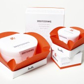
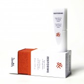
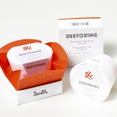
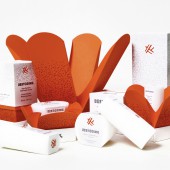
| DESIGN NAME: Cosmetics Line "Restoring" PRIMARY FUNCTION: Cosmetics Packaging INSPIRATION: The inspiration for this project was the main component of the product line - kombucha. UNIQUE PROPERTIES / PROJECT DESCRIPTION: This project forms a packaging design proposal for the cosmetic company's "Dzintars" new line of products for skin renewal - "Restoring" OPERATION / FLOW / INTERACTION: Packaging design is the beginning of the product's communication with the consumer and it assures the interest of the buyer in making a purchase. Design should be created so that it has its added value. In this project the main feature is the given surprise moment to consumer when the packaging is opened. As you pull the top box off the bottom the inner orange packaging opens up - revealing the product. PROJECT DURATION AND LOCATION: The project started in January 2014 and finished in May 2014 FITS BEST INTO CATEGORY: Packaging Design |
PRODUCTION / REALIZATION TECHNOLOGY: The packaging was made from Kaskade design paper and Ivory board coated paper, covered with Soft Touch laminte. the cosmetics container models were made from plastic rods that underwent various technical operations. SPECIFICATIONS / TECHNICAL PROPERTIES: 14 scale models M1:1 for a cosmetics line that includes 15ml, 30ml, 50ml and 200ml containers. TAGS: "Dzintars" Ltd., kombucha, packaging design, graphics, typography. RESEARCH ABSTRACT: During the development of "Restoring" CHALLENGE: The goal of this project was to emphasize the main component (kombucha) of the product line. From this goal came the greatest creative challange - the attempt to translate kombucha into a visually atractive language. ADDED DATE: 2014-09-29 02:37:46 TEAM MEMBERS (1) : IMAGE CREDITS: Image No 1: Photographer Marcis Gaujenietis, 2014 Image No 2: Photographer Marcis Gaujenietis, 2014 Image No 3: Photographer Marcis Gaujenietis, 2014 Image No 4: Photographer Marcis Gaujenietis, 2014 |
||||
| Visit the following page to learn more: http://bit.ly/1wpch4q | |||||
| AWARD DETAILS | |
 |
Cosmetics Line "restoring" · Read the interview with designer Marta Gintere for design Cosmetics Line "Restoring" |
| SOCIAL |
| + Add to Likes / Favorites | Send to My Email | Comment | Testimonials | View Press-Release | Press Kit |
Did you like Marta Gintere's Packaging Design?
You will most likely enjoy other award winning packaging design as well.
Click here to view more Award Winning Packaging Design.


