Fisj Canned Fish Packaging Concept by Simen Wahlqvist |
Home > Winners > #36941 |
 |
|
||||
| DESIGN DETAILS | |||||
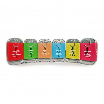
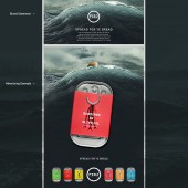
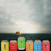
| DESIGN NAME: Fisj PRIMARY FUNCTION: Canned Fish Packaging Concept INSPIRATION: My motive for creating this project was to create a packaging design solution that would be easily recognisable and that would stand out from its competitors. The inspiration for the final design was gathered while spending time inspecting all kinds of tin can packaging and getting to know the material. I also really wanted to create a product that would make people eat more healthy. The goal is that customers that usually do not buy these kinds of products will stop and look at the cans and want to buy them immediately. UNIQUE PROPERTIES / PROJECT DESCRIPTION: This is FISJ Seafoods brand new line of fictional breakfast spreads. Its aim is to simply stand out on the supermarket shelf using bold type treatment and stripped down and easy to understand visuals. Its look is more artisinal, colourful and modern than the present day competition. The container itself is made of tin except for the pull tab which is made of steel to be able to support its symbolic fish hook shape. The "J" in the name and logo mark also allude to a fish hook. I also unique in the sense that you understand the concept of the package design after just looking at it for a second. Even kids can see that it is a fish on a hook. OPERATION / FLOW / INTERACTION: It is basically a normal canned fish package except for the fact that a piece of the pull tab has been eliminated so that it achieves the shape of a fish hook. The graphics on the paper wrapped around the packaging solution depicts a fish hanging from said hook. PROJECT DURATION AND LOCATION: August 1st - August 21st 2014. Oslo FITS BEST INTO CATEGORY: Packaging Design |
PRODUCTION / REALIZATION TECHNOLOGY: The canister is made of tin while the pull tab is made of re-enforced steel to support its fish hook shape. The wrap around is 250g paper. SPECIFICATIONS / TECHNICAL PROPERTIES: The package is dimensions are 105mm tall, 63mm wide, 28mm thick. TAGS: Fish, Tin can, Hook, Breakfast spread RESEARCH ABSTRACT: For this project a walked countless supermarket isles to see the lay of the land and gather information that would be relevant for the project. CHALLENGE: The hardest part about the design process was showing restraint and and letting the minimalist design language speak for it self. ADDED DATE: 2014-09-28 09:26:40 TEAM MEMBERS (1) : Simen Wahlqvist IMAGE CREDITS: Simen Wahlqvist |
||||
| Visit the following page to learn more: http://simenwahlqvist.dunked.com | |||||
| AWARD DETAILS | |
 |
Fisj Canned Fish Packaging Concept by Simen Wahlqvist is Winner in Packaging Design Category, 2014 - 2015.· Read the interview with designer Simen Wahlqvist for design Fisj here.· Press Members: Login or Register to request an exclusive interview with Simen Wahlqvist. · Click here to register inorder to view the profile and other works by Simen Wahlqvist. |
| SOCIAL |
| + Add to Likes / Favorites | Send to My Email | Comment | Testimonials | View Press-Release | Press Kit |
Did you like Simen Wahlqvist's Packaging Design?
You will most likely enjoy other award winning packaging design as well.
Click here to view more Award Winning Packaging Design.


