Celestial Heights - reflect illusion Residential - apartment by Tik Chan |
Home > Winners > #36912 |
 |
|
||||
| DESIGN DETAILS | |||||
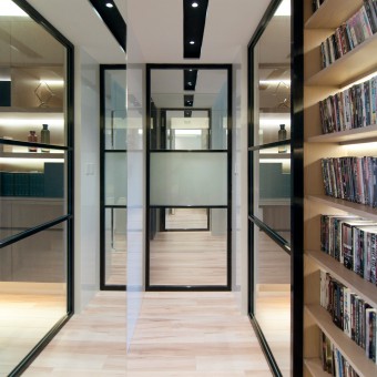
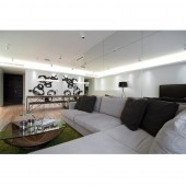
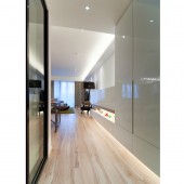
| DESIGN NAME: Celestial Heights - reflect illusion PRIMARY FUNCTION: Residential - apartment INSPIRATION: Soft tones and clean lines make this apartment the perfect showcase for designer furniture. UNIQUE PROPERTIES / PROJECT DESCRIPTION: When Tik Chan, Design Director of Studio 93 was asked to renovate the home of a Celestial Heights couple, the challenge was always going to be how to integrate the pair's European furniture collection into the space yet still make it liveable and comfortable. Thanks to a few design tricks, this project was a triumph of style and practicality. Because European furniture tends to have sizeable proportions, it was important to make sure it didn't dominate the living and dining areas. With that in mind, Tik Chan sought to keep the rooms balanced using white wall paint and neutral tones on the floors and shelving to from a cohesive dialogue between the furniture and the apartment space. The couple wanted a simple décor in order to showcase their furniture but this certainly didn't mean they wanted a plain apartment. “Although I didn’t put many colours to the wall and the cabinets, the irregular form and lighting effect of the cabinets become interesting elements on the wall,” explains Tik Chan. The physical footprint of the dining table and L-shaped sofa are considerable in the room, but the use of mirrors, well positioned art, streamlined cabinets and a clutter free décor gives a real sense of space and light. The IT and Fashion professionals also needed the apartment to work with their Busy lifestyle, and the study was created with this in mind. Not only does the space provide a practical yet warm office in which the husband can work, but it also means that when friends come to visit there is space to host them with minimal fuss. So too the hallways, foyer and kitchen needed to be practical. To maximize the space in the foyer the shoe cabinet was kept slim line and the kitchen door was replaced with a sliding partition. In the hall, mirrors and shelving make it a useful storage area for the couple’s extensive DVD collection, but it also opens up this zone so that it feels like a room more so than a passageway. Black panelling with down lighting in the hall works to propel the eye forward and into the master bedroom where mirrors have been used again to great effect. The cubicle space that encloses the bathroom has been mirrored from top to bottom with a hidden door for both bathroom and wardrobe- the result is a seamless journey from hall to bed with maximum storage and functionality for the couple. While simplicity was key, the success of this project was in translating this into a classically beautiful canvas on which these stunning pieces of furniture could be showcased. OPERATION / FLOW / INTERACTION: - PROJECT DURATION AND LOCATION: 2013 in HONG KONG FITS BEST INTO CATEGORY: Interior Space and Exhibition Design |
PRODUCTION / REALIZATION TECHNOLOGY: - SPECIFICATIONS / TECHNICAL PROPERTIES: 150sqm TAGS: INTERIOR, DESIGN, SPACE RESEARCH ABSTRACT: - CHALLENGE: When Tik Chan, Design Director of Studio 93 was asked to renovate the home of a Celestial Heights couple, the challenge was always going to be how to integrate the pair's European furniture collection into the space yet still make it liveable and comfortable. Thanks to a few design tricks, this project was a triumph of style and practicality. ADDED DATE: 2014-09-27 22:53:42 TEAM MEMBERS (1) : Tik Chan IMAGE CREDITS: STUDIO 93 |
||||
| Visit the following page to learn more: https://WWW.STUDIO93.COM.HK | |||||
| AWARD DETAILS | |
 |
Celestial Heights-Reflect Illusion Residential-Apartment by Tik Chan is Winner in Interior Space and Exhibition Design Category, 2014 - 2015.· Read the interview with designer Tik Chan for design Celestial Heights - reflect illusion here.· Press Members: Login or Register to request an exclusive interview with Tik Chan. · Click here to register inorder to view the profile and other works by Tik Chan. |
| SOCIAL |
| + Add to Likes / Favorites | Send to My Email | Comment | Testimonials | View Press-Release | Press Kit |
Did you like Tik Chan's Interior Design?
You will most likely enjoy other award winning interior design as well.
Click here to view more Award Winning Interior Design.


