Music360 Awareness and Advertisement by Clive Choo |
Home > Winners > #36582 |
 |
|
||||
| DESIGN DETAILS | |||||
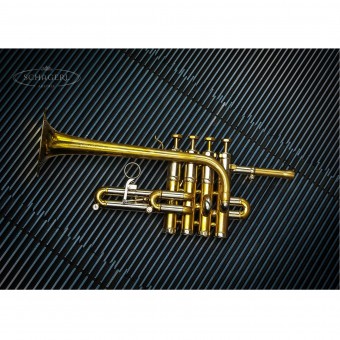
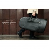
| DESIGN NAME: Music360 PRIMARY FUNCTION: Awareness and Advertisement INSPIRATION: We get our shots through witty tag lines or accidental encounters such as impromptu locations or props that best bring out the products which otherwise wouldn't have been thought to be presented in that fashion especially in this industry. UNIQUE PROPERTIES / PROJECT DESCRIPTION: Band equipments have always been a very traditional art form especially in the aspect of retail. My company has chosen to break the tradition and present them in more edgy representations that we believe connects with a younger generation of musicians and consumers, allowing them to see and perceive this art form and music retail in a different light. Our wish is to evolve the way people perceive band instruments and mundane accessories and engage and interact with them on another level. OPERATION / FLOW / INTERACTION: Everyday yet intimate products like musical instruments or an accessory of a musician is highlighted in a different light and this provokes and offers them an alternate view where traditional presentation fails to deliver. This lack of punch and innovation in the delivery of a similar message or idea has not been fully explored by industry players until now. PROJECT DURATION AND LOCATION: Different photo project was conceived in various locations but mostly in unsuspecting locations with unsuspecting tools. |
PRODUCTION / REALIZATION TECHNOLOGY: DSLR camera, photoshop, lightroom. Assorted materials as props SPECIFICATIONS / TECHNICAL PROPERTIES: 3:2 Ratio. 600 by 400 Photo TAGS: music, instruments, band, retail, advertisement RESEARCH ABSTRACT: We observed and interviewed fellow industry key players in our local context to understand what appeals to their needs and determine what they will like to see ,revitalized and represented for such an old craft. This proved to be an especially important process as we were then able to fuse the modern and the old and concoct a combination which draws their attention and at the same time imprints an idea which aligns with what they have in mind. CHALLENGE: The hardest part was to create a witty tagline to accompany the photo image that resonates with the consumer and at the same time appeal to their sense of the aesthetics. ADDED DATE: 2014-09-22 12:26:05 TEAM MEMBERS (1) : IMAGE CREDITS: Image#1: Photographer Clive Choo, Schagerl, 2014. Image#2: Photographer Clive Choo, Performance Take Flight, 2013 Image#3: Photographer Clive Choo, Reunion Blues, 2013 Image#4: Photographer Clive Choo, Tailoring Music Needs, 2013 Image#5: Photographer Clive Choo, Sterling, 2013 |
||||
| Visit the following page to learn more: https://www.musicthreesixty.com | |||||
| AWARD DETAILS | |
 |
Music360 Awareness and Advertisement by Clive Choo is Winner in Advertising, Marketing and Communication Design Category, 2014 - 2015.· Read the interview with designer Clive Choo for design Music360 here.· Press Members: Login or Register to request an exclusive interview with Clive Choo. · Click here to register inorder to view the profile and other works by Clive Choo. |
| SOCIAL |
| + Add to Likes / Favorites | Send to My Email | Comment | Testimonials | View Press-Release | Press Kit |
Did you like Clive Choo's Advertising Design?
You will most likely enjoy other award winning advertising design as well.
Click here to view more Award Winning Advertising Design.


