DESIGN NAME:
minda product museum
PRIMARY FUNCTION:
Product Display and Information Center
INSPIRATION:
The minda group - is one of the largest OEM manufacturers in the automotive industry in India and also has growing presence in the world catering to various overseas manufacturers across the globe.
So for their product museum - the design inspiration came from their product itself -precision machined, engineered, and with understated sophistication - as their products are rarely seen by the people as a product - but actually drives almost all automobiles on our roads and make them function and perform better.
The elements of the space also get influenced by the ambition of the group to be a major player in the global market - acquiring and or connecting to their global competitors. The groups fast paced maneuvers are captured by the overall zagged and angular yet flowing layout of the space. The overall look is kept - extremely simple and minimal, yet giving the space a machined look with seamless white flowing walls with angular edges. All functional display spaces required were either designed as a projection out of that seamless wall or as a cut into that same angular edgy wall.
UNIQUE PROPERTIES / PROJECT DESCRIPTION:
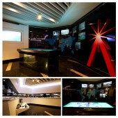
The display museum is also dominated by a custom tinted glass communication wall which is a dynamic digital wall and controlled by a horizontal touch surface - which allows the visitors to interact with the company products digitally, and connect to the company facilities spread across 13 different countries - in real time.
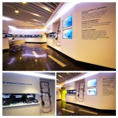
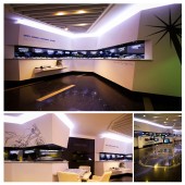
The display area also has selected physical products and components - displayed on the white ledges that seamlessly projected out or cut inside of the white edgy running periphery walls. The display background wall is again a sensor based black glass wall -where the product information and features appear - as a visitor approaches the particular product kept on the ledge.
The display center is designed to have a break in the white flowing display wall - to have a section for future products - where the future product development aspects are displayed through a digital holographic display.
OPERATION / FLOW / INTERACTION:
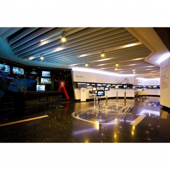
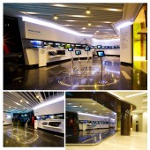
The visitors who come to the minda group HQ reception - are greeted by the display museum at the right hand side wing of the building. The entrance for the place is an open facade which invites the visitors to get into this area and explore. At the entry point there is the floor etched automotive technical drawing and the arrangement of glowing acrylic pods with screens - those displays the different category of products the company manufactures.
At the front wall the - tinted dynamic glass wall is placed and controlled by the huge horizontal touch surface with a group mnemonic logo placed on the glass wall.The white acrylic solid surface angular wall with physical displays is situated at the right wing of the place. At the middle of this wall we have the discussion area and a small meeting area near the holographic display wall which depicts future research and developments.
The space also displays the corporate social responsibility initiatives taken up by the company and talks about the environmental initiatives of the group.
PROJECT DURATION AND LOCATION:
the project started in Jan 2013 in gurgaon, india and finished in September 2013.
FITS BEST INTO CATEGORY:
Interior Space and Exhibition Design
|
PRODUCTION / REALIZATION TECHNOLOGY:
The unique dynamic wall was created using multiple led screens placed at strategic places behind the tinted glass which is colour etched with world map showing company locations.The wall normally looks like a sophisticated glass wall displaying world presence - but lights up with led screens when someone wants to see or interact with a particular company plant at any location on the map.
The wall can be controlled through a unique touch surface that was developed by invoxell and the content was designed in collaboration with minda marketing division.
The floor of the space was designed with engineered sparkled stone - with an automobile technical drawing laser etched onto the floor surface - with solid glass pods with small screens - placed at different locations on the drawing - to communicate different category & placement of products manufactured by the company.
The white running edgy periphery wall was developed in acrylic solid surface from LG-himac and thermoformed in the desired planes and edges with display ledges coming out and niches set in.
SPECIFICATIONS / TECHNICAL PROPERTIES:
The minda display museum is created on 180 square meter area with a surrounding visitors area of around 300 sq meters which is strategically located at the reception of the minda group corporate HQ.
TAGS:
automotive, component, display, exhibition, museum, interactive
RESEARCH ABSTRACT:
We were required to do a thorough research on the interactive touch surfaces and the sensor based interfaces for the features and information displays - and come up with simplistic detailing to keep the overall feel for the space very very minimal yet providing a very technologically enhanced look.
CHALLENGE:
The creative challenge was to find a right balance for the lighting levels at different points in the museum space. The touch surface and dynamic wall area was designed to have indirect lighting which does not interferes with the horizontal touch surface. The floor etched category display area was treated with led spots through the aluminum baffled ceiling. The display niches were lit with sunk-in led spots which avoids any reflection of light onto the back black glass where the sensor activated display product information appear as some visitors approach the displays.
ADDED DATE:
2014-08-26 07:06:13
TEAM MEMBERS (3) :
devesh bhatia, pratyay chakrabarti and parag anand
IMAGE CREDITS:
Nexus design Integrated Pvt. Limited, 2014.
|


