DESIGN NAME:
3M PTL Kit
PRIMARY FUNCTION:
Educational Kit
INSPIRATION:
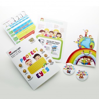
By creating a small kit and placing in the elements of a fun yet educational design creates excitement in both the buyer and the product. The kit is interactive throughout and yet contemporary. The information can be easily replaced. The main idea was to get the audience into entering and exploring the world of 3M Polarizing Light anti-glare world where children can study and play at the same time. The icons of rainbows are used to create the playfulness of the folder. And the child can make the folder exclusive to themselves by writing their name on it and be proud to show it to their friends, together with the 3M Protects My Eyes badge.
UNIQUE PROPERTIES / PROJECT DESCRIPTION:
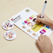
This kit is exclusively given out to the children who purchases a 3M Polarizing Light. It is catered to children, educating them about eye care tips, about how 3M Polarizing Light technology helps them protect their eyes. In the kit are loose sheets of information about the products and their characteristics which makes it contemporary. In the cover the child can write their names on the yellow tag. This will reinforce the idea of "3M Polarizing Light protects "Child's name" eyes, giving them and their parents the assurance of the lamp's effectiveness. To further boost the entire idea, a badge design is given out to the child purchasing the lamp. It acts as an exclusive item, where they can place on their bags and tell their friends about choosing the right lamp. In turn, it will create the urge for the audience to find out more about the product itself.
OPERATION / FLOW / INTERACTION:
The audience will receive the folder and the important factor is to make it exclusive. It acts like the 'certificate�39; of the 3M Polarizing Light Lamp. Each folder has a tag so you can write their name and call it their own. In addition, the exclusive "3M Polarizing Light Protects My Eyes" gives it an instant message: Protect your eyes the best way, use 3M Polarizing Light.
PROJECT DURATION AND LOCATION:
This project started in February 2014 and ended in June 2014.
FITS BEST INTO CATEGORY:
Idea and Conceptual Design
|
PRODUCTION / REALIZATION TECHNOLOGY:
Inspired by the very idea of a checkup file, we modified it into a fu and interactive kit that not only educates but provide a sense of ownership to the child. Fun illustrations are used to bring out the style of a happy world. Furthermore a badge design is conceptualised to cater to the kids where they can use to pin on their favourite bags, clothes or fabric so they can share it with their friends.
SPECIFICATIONS / TECHNICAL PROPERTIES:
The kit design measures 158mm (w) x 210mm (h), full colour printing with a die cut flap in the inside. The leaflet inside is of A5 size. The badge design measures 58mm in diameter.
TAGS:
#3MPolarizingLight #3mprotectsmyeyes #antiglareexperience
RESEARCH ABSTRACT:
-
CHALLENGE:
The challenge here was how to establish a sense of ownership. How to capture the attention and how can the design influence others to become curious. How can it evoke the urge to find out more? The solution was simple. The idea was to make the folder customisable. It had to be attractive so the child will be drawn to it instantly. The audience can write their names and own the folder design as though the lamp belongs to them. Next the influence was to create a hype. The child can wear the badge and boast about their parent's foresight to get them the best lamp that truly cares for their eyes. In turn, the badge would be a tool to their friends in asking more about the lamp through their parents.
ADDED DATE:
2014-07-25 04:40:10
TEAM MEMBERS (2) :
Creative Director: Lawrens Tan and Designer: Phoebe Chang
IMAGE CREDITS:
Photography: Watson Lau
Printer: Grenadier Press Pte Ltd
|


