|
|
|

|
|
| DESIGN DETAILS |
DESIGN NAME:
Insal'Arte
PRIMARY FUNCTION:
Food packaging (Fresh Salad)
INSPIRATION:
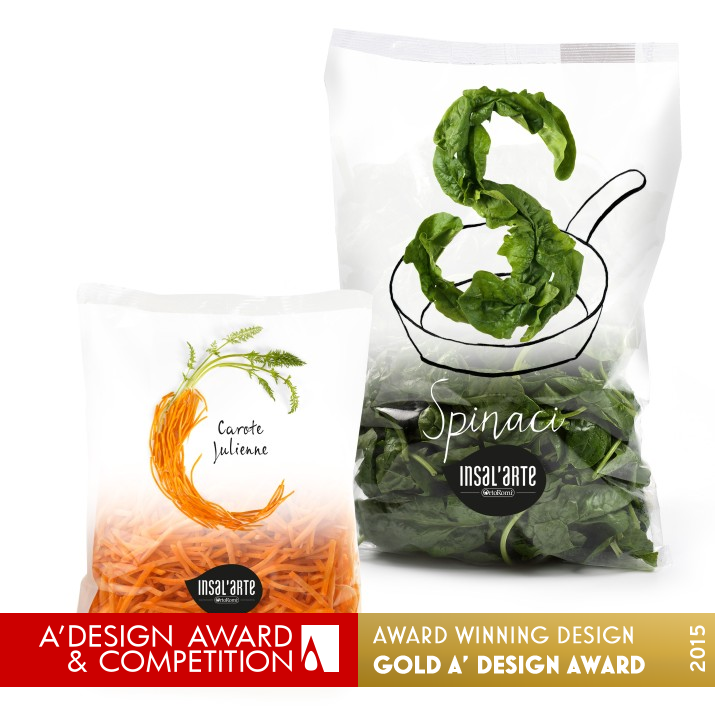
The idea was to create a new graphic language for fresh cut salads, an elegant and polished one that could show a playful side by re-creating the alphabet letters giving the opportunity to play with words.
UNIQUE PROPERTIES / PROJECT DESCRIPTION:
The real strenght of this packaging is that it is not only just a decoration but it has twofold functions, first of all it shows the product that you are going to buy, then makes its name and its typology easily recognizable (every package shows the initial letter of the product which is inside of it, as for example C for Carote, V for Valerianella etc.) but also it gives the opportunity to the sellers and to the consumer to create phrases and to play with the letters.
OPERATION / FLOW / INTERACTION:
This packaging creates an actual language by associating products, creating words in stores and at home as well. At the same time it is possible for the consumer to associate every letter to a name or an action, for example there is a Cuori line, and it refers to Cuore di Lattuga, Cuore di Riccia (Cuore in italian means heart and it refers to the heart of the product), which can be easily used in adv campaigns, events or social networks as well.
PROJECT DURATION AND LOCATION:
The project started in Maggio 2014, and was exhibited in Milano Food Week in 16 - 19 Maggio 2014.
FITS BEST INTO CATEGORY:
Food, Beverage and Culinary Arts Design
|
PRODUCTION / REALIZATION TECHNOLOGY:
Print in polypropylene bag or polypropylene tray, closed with an anti-fog film through flowpack system.
SPECIFICATIONS / TECHNICAL PROPERTIES:
Ready to eat fresh salad BAG dimensions, Width 250 mm x Depth 30 mm x Height 250 mm.
Ready to eat fresh salad TRAY dimensions, Width 200 mm x Depth 70 mm x Height 130 mm.
Ready to be cooked vegetables BAG dimensions, Width 295 mm x Depth 70 mm x Height 440 mm.
TAGS:
Mirco Luzzi, Food Packaging, Salad, Insalarte, Ortoromi, Design, Graphic
RESEARCH ABSTRACT:
The aim of OrtoRomi with InsalArte is to give the company an identity of excellence, gathering the best of its production in terms of control, selection and warranty. We decided to pursue this aim by simply showing the product, removing all of the usual phrases that are used to describe the product inside of it but by foregrounding the product itself. The consumer’s reaction was positive, as this packaging was perceived refined, fun and friendly thanks to the letter.
CHALLENGE:
Difficulties. On the first place the creation of the letter sculpture with salads due to the physiological deterioration of fresh vegetables during staging and due to the difficulties of finding the ideal structure to support itself keeping at the same time the lightness perception and to enlight the freshness and the genuine quality of the product. Other difficulties at the printing phase, in order to get the desired soft effect of the white fading we turned to rotogravure printing machines.
ADDED DATE:
2014-07-09 15:04:12
TEAM MEMBERS (3) :
Creative and Art Direction: Mirco Luzzi, Photographer: Gaetano DeRosa and Copywriter: Martina Boromello
IMAGE CREDITS:
Image #1: Photographer Gaetano DeRosa / Mirco Luzzi, Insal'Arte, 2013.
Image #2: Photographer Gaetano DeRosa / Mirco Luzzi, Insal'Arte, 2013.
Image #3: Photographer Gaetano DeRosa / Mirco Luzzi, Insal'Arte, 2013.
|
| Visit the following page to learn more: http://www.deofficina.com/ |
|
| CLIENT/STUDIO/BRAND DETAILS |
 |
NAME:
ORTOROMI
PROFILE:
DeOfficina Studio Design created the brand and packaging of Insal’Arte for OrtoRomi.
OrtoRomi is one of the largest national producers of the ready to eat salads, with exports throughout the rest of Europe.
OrtoRomi has been on the market for more than 18 years and it is structured as an agricultural cooperative business that includes 27 farms, to get the control of the entire agricultural food chain, from seeds up to the selling of the final product.
With Insal’Arte, OrtoRomi gives the company itself an excellence identity, gathering the best of its production in terms of control, selection and warranty.
Insal’Arte brand contains in every leaf the passion and the experience acquired through OrtoRomi’s history.
|
|
|
| COMMENTS |
| Giulia Esposito |
Comment #1664 on December 24, 2022, 8:41 pm |
|
As a design enthusiast, I am absolutely blown away by the beauty and functionality of this packaging design. The colors, shapes and textures tastefully come together to craft a visually pleasing and memorable experience. The way it elegantly presents the salad is truly inspiring. Its ability to maintain the freshness of the product while keeping the packaging simple and stylish is remarkable. It is a true testament to the designer's attention to detail and creative genius. Kudos to Mirco Luzzi for their outstanding A' Design Award winning work, Insal'Arte.
|
| Thomas Anderson |
Comment #18574 on January 3, 2023, 5:48 am |
|
What a clever and creative packaging design! It's amazing to see how Mirco Luzzi has taken a typical product packaging and used it as a way to communicate something much deeper and entertaining. I love the idea of creating a new graphic language for fresh cut salads, that is both elegant and playful. It's a great way to make the product stand out and give customers something to interact with. And the use of alphabet letters to represent the product type is so clever! It's no wonder that this work has been rewarded with the A' Design Award.
|
| Victoria Hill |
Comment #19490 on January 3, 2023, 6:07 am |
|
The work "Insal'Arte" by Mirco Luzzi is truly remarkable. It stands out as an amazing example of packaging design, utilizing a unique graphic language to give the packaging a playful side. The letter sculptures created with fresh vegetables gives the packaging a lightness perception, emphasizing the freshness and genuine quality of the product. The attention to detail and the creativity behind this design is simply breathtaking, making it a worthy winner of the Platinum A' Design Award.
|
| Paul Williams |
Comment #21688 on January 3, 2023, 6:48 am |
|
I was captivated by Insal'Arte – the award-winning food packaging design by Mirco Luzzi. This creative work is the perfect example of a design that has twofold functions – it shows the product inside and also provides the opportunity to create phrases and play with the letters. The idea behind this packaging was to create a new graphic language for fresh cut salads, one which is elegant and polished, but also playful. It was also a challenge to create the letter sculptures with salads due to the physiological deterioration of the vegetables and the difficulty of finding the ideal structure to support them while also maintaining a lightness perception. Despite the challenges, Mirco Luzzi managed to produce a packaging that was perceived as refined, fun and friendly. The printing process was also complex, as the desired soft effect of the white fading was achieved through rotogravure printing machines. All in all, the success of Insal'Arte is an impressive testament to Mirco Luzzi's remarkable design skills, and I admire their achievement in winning the A' Packaging Design Award.
|
| Valentina Rossi |
Comment #22118 on January 3, 2023, 6:57 am |
|
This award-winning work is an excellent example of how good design can be used to create an elegant, playful and friendly packaging that showcases the product inside. It is a perfect example of how to combine form and function in a creative and innovative way.
|
| Adam Harris |
Comment #23462 on January 3, 2023, 7:22 am |
|
The work titled "Insal'Arte" is an outstanding example of good design and deserves to be celebrated. It is a great example of how packaging design can be used to create an aesthetically pleasing, playful and unique experience. The idea of using the alphabet letters to show the product inside is highly creative and engaging. The research that was put into creating the packaging was evident in the soft, elegant effect of the white fading. The sculpted letters made of fresh vegetables was no easy feat, yet the result is truly remarkable. This award-winning design is definitely worth praising and celebrating.
|
| Patricia Miller |
Comment #24353 on January 3, 2023, 7:39 am |
|
This award-winning work is an outstanding example of excellent design, offering a unique graphic language, playful and fun alphabet letters, and a refined and friendly presentation of the product.
|
| Elisabeth Clark |
Comment #25117 on January 3, 2023, 7:54 am |
|
I'm absolutely amazed by Mirco Luzzi's design work, Insal'Arte! It's a brilliant example of how design can be both elegant and playful. The concept of using the alphabet to represent the product inside the packaging is truly unique and it gives the customer the opportunity to create their own phrases and have some fun. The research behind the project is clear - to give the company a sense of excellence and to foreground the product itself - and the consumer reaction is proof that this was achieved. This is a truly outstanding design and it is no surprise that it has been awarded the A' Design Award.
|
| Chloe Turner |
Comment #25243 on January 3, 2023, 7:56 am |
|
The work of Mirco Luzzi is truly inspiring! It's amazing how they were able to create an elegant and polished graphic language for fresh cut salads while also incorporating a playful side. The use of the alphabet to create words is creative and unique - it's a clever way to add a fun aspect to the design. This project is a true example of how packaging design can be used to create something that is both aesthetically pleasing and functional. A' Design Award is well deserved for this work!
|
| Mark Allen |
Comment #26200 on January 3, 2023, 8:16 am |
|
This award-winning packaging design is truly revolutionary and admirable. Its ability to combine aesthetics and practicality is admirable, utilizing a playful yet elegant graphic language to highlight the product inside. The research and care that was put into creating the letter sculptures with fresh vegetables is remarkable, as is the complexity of the printing process to achieve the desired soft effect of the white fading. This work is an example of how packaging design can be functional and beautiful.
|
| Elena Petrenko |
Comment #28367 on January 3, 2023, 8:57 am |
|
Mirco Luzzi's "Insal'Arte" is a cleverly designed food packaging that incorporates a playful use of the alphabet letters to create an elegant, polished look.
|
| Hien Nguyen |
Comment #74244 on January 4, 2023, 4:44 am |
|
I am extremely impressed with Mirco Luzzi's award-winning design, "Insal'Arte". This innovative packaging design demonstrates a great level of creativity and skill, and it is a testament to his hard work and dedication. I am delighted that he has been recognized for this achievement.
|
|
|
Did you like Mirco Luzzi's Packaging Design?
You will most likely enjoy other award winning packaging design as well.
Click here to view more Award Winning Packaging Design.
Did you like Insal'arte Food Packaging (fresh Salad)? Help us create a global awareness for good packaging design worldwide. Show your support for Mirco Luzzi, the creator of great packaging design by gifting them a nomination ticket so that we could promote more of their great packaging design works.
|
|

|
|
|
|


