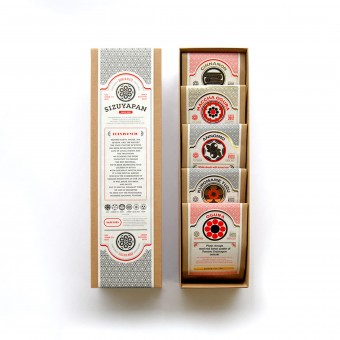
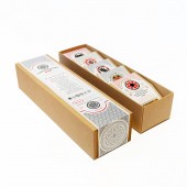
SIZUYAPAN An-Pan packaging (Bread Packaging) by Katsuya Arai |
Home > Winners > #35382 |
 |
|
||||
| DESIGN DETAILS | |||||
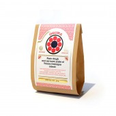
| DESIGN NAME: SIZUYAPAN PRIMARY FUNCTION: An-Pan packaging (Bread Packaging) INSPIRATION: I was thinking I can not be interested expression in geometric modeling and the beautiful curve of Japanese the family crest. I also was thinking links with Alphabet and its crest and produce a new representation method. UNIQUE PROPERTIES / PROJECT DESCRIPTION: Westen-style Bakery was founded in Kyoto in 1948, is called Sizuya The package design of the new brand Sizuyapan which dealt with only An-pan (red beans paste in the Japanese style bread) from the Western-style bakery Sizuya Design deployment to which the identity (Japanese style crest )and attractive shape of An-pan was made to link. Each identity link to each bread for establishing a design concept. the our approach was expressed to the Japanese-ism of the present form by using European languages abundantly in the whole package. The concern about traditional culture is falling in Japan in recent years. It has also influenced the impression to Japan which saw from outside of the country. Japanese traditional culture is anew sent to the world by the design of Sizuyapan which set the axis of the design as strong identity. Moreover, having used European languages abundantly also originates in it. OPERATION / FLOW / INTERACTION: One unique feature to the label is the PROJECT DURATION AND LOCATION: Project ideation originated at Sizuya in 2012. Final product was launched into the marketplace in October, 2012. FITS BEST INTO CATEGORY: Packaging Design |
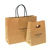
PRODUCTION / REALIZATION TECHNOLOGY: using Craft Paper, Eco paper. SPECIFICATIONS / TECHNICAL PROPERTIES: 6 pieces assorted package : Height: 65mm X Width: 85mm X Depth: 308mm, Each package : Height: 100mm X Width:80mm X Depth: 40mm, TAGS: Bread, Food, Japanese, Branding, Crest, Packaging, Unique, Modern, Vateau RESEARCH ABSTRACT: At first experience that I used Japanese tradition to design. I researched the origin of Japanese tradition, also, young people's mainstream (what kind of design is most attractive for young people), then I was trying to find out the common of those two for combaining of two elements of design. CHALLENGE: Most challenge thing was how to show and express Japanese-ism by package. Package have to be attractive therefore, Label on the surface of package made to very understandable and high communication. ADDED DATE: 2014-06-23 04:48:31 TEAM MEMBERS (1) : Art Director/Designer : Katsuya Arai IMAGE CREDITS: Image1:©Vateau_sizuya_main,2014 Image1:©Vateau_sizuya_option_1,2014 Image2:©Vateau_sizuya_option_2,2014 Image3:©Vateau_sizuya_option_3,2014 Image4:©Vateau_sizuya_option_4,2014 |
||||
| Visit the following page to learn more: http://www.vateau.com | |||||
| AWARD DETAILS | |
 |
Sizuyapan An-Pan Packaging (bread Packaging) by Katsuya Arai is Winner in Packaging Design Category, 2014 - 2015.· Read the interview with designer Katsuya Arai for design SIZUYAPAN here.· Press Members: Login or Register to request an exclusive interview with Katsuya Arai. · Click here to register inorder to view the profile and other works by Katsuya Arai. |
| SOCIAL |
| + Add to Likes / Favorites | Send to My Email | Comment | Testimonials | View Press-Release | Press Kit |
Did you like Katsuya Arai's Packaging Design?
You will most likely enjoy other award winning packaging design as well.
Click here to view more Award Winning Packaging Design.


