Rue Marcellin E-commerce Website by Tom Gatenby - Squashed Pixel Ltd |
Home > Winners > #35311 |
 |
|
||||
| DESIGN DETAILS | |||||
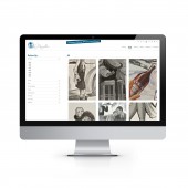
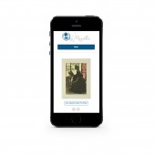
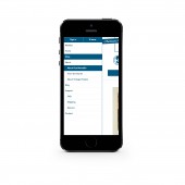
| DESIGN NAME: Rue Marcellin PRIMARY FUNCTION: E-commerce Website INSPIRATION: The key objectives for the project was to create a clean, simple, user-friendly site and brand. That is cool and appealing to different generations who are interested in vintage art. In creating this new brand and store the primary purpose was to generate sales through showcasing the quality and detail of the prints, whilst maintaining a fully responsive and user-friendly experience. As the company are based in both Canada and Paris the inspiration for the brand and style came from 1900's Parisian vintage. UNIQUE PROPERTIES / PROJECT DESCRIPTION: As a new company there was no existing online presence to build on so the design and build could solely focus on the objectives of making the artwork as easily accessible as possible with the highest level of detail available to the prospective buyers across all devices. With this as the primary focus, the site needed to have a clean, fresh appearance whilst containing a powerful search and indexing facility for the prints and an innovative way of zooming into the finer detail of the artwork. OPERATION / FLOW / INTERACTION: In order to create a searchable online art gallery we developed a clean, precise filtering system within the shop page allowing the users to refine the products down to their exact requirements. All achieved without the visitor leaving the shop page. By selecting a product, customers are shown additional information and have the ability to zoom into the image to view the finer detail. To ensure responsiveness a simple menu structure was created, with a hidden side bar menu for mobile devices. PROJECT DURATION AND LOCATION: The project commenced in September 2013 with the first phase concentrating on the creation of the branding and logo design. This was then following by the design, build and content phases with the project finished and the site live on the 12th December 2013. |
PRODUCTION / REALIZATION TECHNOLOGY: Using the Shopify eccomerce platform a fully custom build and design was created utilising HTML, CSS, JQuery and Liquid. The key innovation achieved was the search functionality within the shop which utilised tags within the products, enabling a greater flexibility and depth to the search facility without comprising the design, usability and responsiveness. Along-side this innovation, a custom zoom was implemented allowing the images to zoom out on roll over to create a unique experience. SPECIFICATIONS / TECHNICAL PROPERTIES: Variable content width at 90% screen size based on a 12 column grid. TAGS: E-commerce, Responsive, Art Gallery, Shopify, Vintage French RESEARCH ABSTRACT: We began by researching vintage Parisian art utilising the client based in Paris, to understand the desired style for the brand, as this would lay the foundations for the overall site design. During this research phase we analysed competitor websites to identify their weaknesses from a usability and interface design view point. Our findings resulted in a clean, minimalist design, which draws the users into the product artwork, whilst remaining fully responsive and stylish on mobile devices. CHALLENGE: The main challenge faced was the level of refining required within the shop and how to implement this without compromising the ease and clarity of the user experience and speed of purchase. Furthermore it was essential that the images had a quality zoom function to ensure the visitor had the ability to see the finest detail of each product as if at a real life gallery, regardless of the device they were using to access the site. ADDED DATE: 2014-06-18 16:44:08 TEAM MEMBERS (1) : Tom Gatenby IMAGE CREDITS: All images copyright of Rue Marcellin |
||||
| Visit the following page to learn more: http://www.ruemarcellin.com/ | |||||
| AWARD DETAILS | |
 |
Rue Marcellin E-Commerce Website by Tom Gatenby-Squashed Pixel Ltd is Winner in Website and Web Design Category, 2014 - 2015.· Read the interview with designer Tom Gatenby - Squashed Pixel Ltd for design Rue Marcellin here.· Press Members: Login or Register to request an exclusive interview with Tom Gatenby - Squashed Pixel Ltd. · Click here to register inorder to view the profile and other works by Tom Gatenby - Squashed Pixel Ltd. |
| SOCIAL |
| + Add to Likes / Favorites | Send to My Email | Comment | Testimonials | View Press-Release | Press Kit |
Did you like Tom Gatenby-Squashed Pixel Ltd's Web Design?
You will most likely enjoy other award winning web design as well.
Click here to view more Award Winning Web Design.


