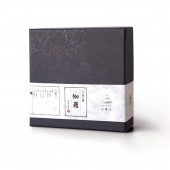
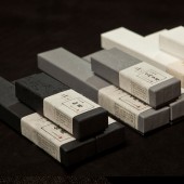
Sense Package by Dongdao Design Team |
Home > Winners > #35256 |
| CLIENT/STUDIO/BRAND DETAILS | |
 |
NAME: Dongdao Creative Branding Group PROFILE: Founded in 1997 and headquartered in Beijing, Dongdao has branches and offices in Shanghai,Guangzhou,Xian, Rome and Berlin. For many years, Dongdao has won a reputation for its design ideas and high efficiency as well as numerous domestic and international awards. Moreover, Dongdao has established itself as a top Chinese agency in brand design and management, a practitioner in the booming creative industry in China. |
| AWARD DETAILS | |
 |
Sense Package by Dongdao Design Team is Winner in Packaging Design Category, 2014 - 2015.· Read the interview with designer Dongdao Design Team for design Sense here.· Press Members: Login or Register to request an exclusive interview with Dongdao Design Team . · Click here to register inorder to view the profile and other works by Dongdao Design Team . |
| SOCIAL |
| + Add to Likes / Favorites | Send to My Email | Comment | Testimonials | View Press-Release | Press Kit |
Did you like Dongdao Design Team's Packaging Design?
You will most likely enjoy other award winning packaging design as well.
Click here to view more Award Winning Packaging Design.


