Tee-Saurus Logo Design, Graphic Tees by Lawrens Tan & Tan Zi Wei |
Home > Winners > #34724 |
 |
|
||||
| DESIGN DETAILS | |||||
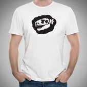
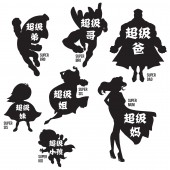
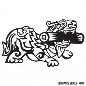
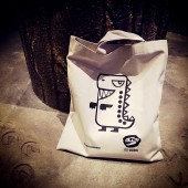
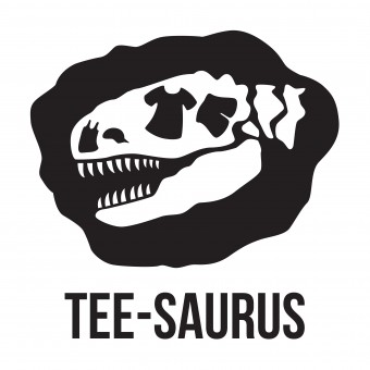
| DESIGN NAME: Tee-Saurus PRIMARY FUNCTION: Logo Design, Graphic Tees INSPIRATION: Several options were brainstormed and it seemed very cliche. Dinosaur characters were implemented but it did not have the wow factor. Chancing upon a graphic fossil of a T-Rex immediately made a spark. And like dinosaur fossils, it was timeless. UNIQUE PROPERTIES / PROJECT DESCRIPTION: Playing with the fun imagery of a dinosaur fossil to bring out the tongue in cheek approach of the brand name "Saurus". Using the fossil was not enough. Somehow the need to push it even further to showcase what the brand does. Thus the idea of replacing the eye sockets with garments were born and it worked really well. It works like a hidden message! OPERATION / FLOW / INTERACTION: Depending on the audience, there is a set that will attract consumers. From family themed graphics to the specially designed Geomancy wearable themes, there is always a selection the audience can have. PROJECT DURATION AND LOCATION: The project started in January 2014 and the logo was completed in April 2014. FITS BEST INTO CATEGORY: Fashion, Apparel and Garment Design |
PRODUCTION / REALIZATION TECHNOLOGY: To make the design distinct, single colour designs are conceptualised. Designs that can be standalone icons, simple yet graphic. Different themes are conceptualised from family tees to dinosaur series, from good luck charms to premium Geomancy series. All of these are printed on high grade cotton to convey the high quality feel. SPECIFICATIONS / TECHNICAL PROPERTIES: - TAGS: #teesaurusproject #graphictees #teedesign #teesaurusthemes RESEARCH ABSTRACT: Different icons were established and related to tee designs as we showcased a variety of logos and asked the public to voice out their views on the selected logos. A selection of three were showcased. And the majority of votes goes to the dinosaur character design. It was decided that in order to make the design more attractive, there was a need to go even more. And the very idea of featuring a fossil immediately stick. Together with the icons of what the brand can offer - apparels. CHALLENGE: The greatest challenge was to not make another cliche using the symbolic tee design. There was a need to go beyond to make consumers remember the logo and what the brand stand for. The keywords were fun, humorous, dynamic yet simple. A fossil was a great discovery but injecting the creative portion was challenging. After numerous rounds of changes, finally the end results were just rewarding. ADDED DATE: 2014-04-09 07:05:58 TEAM MEMBERS (1) : Creative Directors: Lawrens Tan, Tan Ziwei IMAGE CREDITS: Illustrator: Lawrens Tan |
||||
| Visit the following page to learn more: https://www.facebook.com/teesaurusprojec |
|||||
| AWARD DETAILS | |
 |
Tee-saurus Logo Design, Graphic Tees by Lawrens Tan & Tan Zi Wei is Winner in Fashion, Apparel and Garment Design Category, 2014 - 2015.· Read the interview with designer Lawrens Tan & Tan Zi Wei for design Tee-Saurus here.· Press Members: Login or Register to request an exclusive interview with Lawrens Tan & Tan Zi Wei. · Click here to register inorder to view the profile and other works by Lawrens Tan & Tan Zi Wei. |
| SOCIAL |
| + Add to Likes / Favorites | Send to My Email | Comment | Testimonials | View Press-Release | Press Kit |
Did you like Lawrens Tan & Tan Zi Wei's Fashion Design?
You will most likely enjoy other award winning fashion design as well.
Click here to view more Award Winning Fashion Design.


