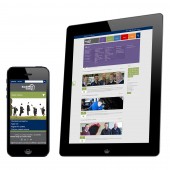
South West College E-learning Website by Donna Strain |
Home > Winners > #34296 |
 |
|
||||
| DESIGN DETAILS | |||||
| DESIGN NAME: South West College PRIMARY FUNCTION: E-learning Website INSPIRATION: In trying to gain new students the first key tangible purpose of the site was to offer information on the courses available in a clear, easy to understand, and searchable way. Ease of use and increased visitors were the watchwords. With this in mind, we decided to implement a flat interface which presents a cleaner look that is characterised by presenting data in grids, extensive use of white space and adoption of solid colour palettes. This resulted in a minimalistic website which offers a cleaner look for content which is easier to scan and process. UNIQUE PROPERTIES / PROJECT DESCRIPTION: Primarily, the strategy was to update an outdated and over complex site to a modernised online presence, in order to appeal to local students but also to enhance the growing interaction with the business community and international students. As a college which offers educational, training, recreational and vocational courses, as well as having dedicated business led and international centres across it's 5 campuses, the site needed to be applicable for use by all, with particular focus on a non confusing interface, and fast access to course searching. OPERATION / FLOW / INTERACTION: The prime innovation was the simplification into a homepage with 5 clear segments, while inner pages needed to be clear, navigable, and functional – with modernity and attractiveness of style remaining essential. Clarity and ease of use combined with the requirement for accessibility and responsiveness for phones & tablets dictated a strict grid layout. However, this was applied to produce a theme which is adaptable across a huge range of styles. PROJECT DURATION AND LOCATION: The first phase of the project started on 7th August 2013 and finished on 21st August 2013 in Omagh. The project is ongoing and future plans for the site include live streamed classes, online assignments and a linked in style CV profile section for students. |
PRODUCTION / REALIZATION TECHNOLOGY: A grid layout played a crucial role in the design - namely to adhere to best practice web usability guidelines by presenting content in a clear, easily navigable format. The largest innovation was the use of a kentico system, allowing for an e-commerce style course search and filtering, improving the user experience hugely. SPECIFICATIONS / TECHNICAL PROPERTIES: Width of content: 980px; Using a 12 column internal grid system. TAGS: Flat Design, Minimal, Clean, Modern, E-Learning, Educational, Kentico RESEARCH ABSTRACT: We began by holding consultation sessions and in-house user testing to understand what the role of the website should be, it’s downfalls and how well competitor websites worked. We soon discovered that the site had a number of clear usability and interface design errors that were continually giving users a poor experience. As a result we decided to take a flat design approach, apply an ecommerce style filter to course listings and use strong solid colours to highlight the 5 areas of the website. CHALLENGE: One of the main challenges was to simplify the site and produce a course search which presented information in a clear and consistent format that was easy to navigate. Timescales presented another challenge, it was imperative for the college that the project was finished in time for GCSE Results day. We had to approach this in two phases as we only had two weeks to ensure that the website was live in time for GCSE Results day. ADDED DATE: 2014-03-27 08:30:44 TEAM MEMBERS (1) : Donna Strain IMAGE CREDITS: All images copyright of Creative Media |
||||
| Visit the following page to learn more: http://www.swc.ac.uk | |||||
| AWARD DETAILS | |
 |
South West College E-Learning Website by Donna Strain is Winner in Website and Web Design Category, 2013 - 2014.· Read the interview with designer Donna Strain for design South West College here.· Press Members: Login or Register to request an exclusive interview with Donna Strain. · Click here to register inorder to view the profile and other works by Donna Strain. |
| SOCIAL |
| + Add to Likes / Favorites | Send to My Email | Comment | Testimonials | View Press-Release | Press Kit |
Did you like Donna Strain's Web Design?
You will most likely enjoy other award winning web design as well.
Click here to view more Award Winning Web Design.


