Gucci's Mobile Website Mobile website by Huge |
Home > Winners > #33465 |
 |
|
||||
| DESIGN DETAILS | |||||
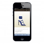
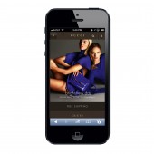
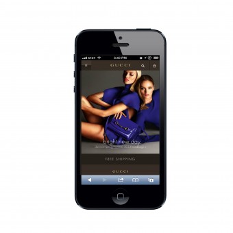
| DESIGN NAME: Gucci's Mobile Website PRIMARY FUNCTION: Mobile website INSPIRATION: The Huge team was inspired by our success with designing other luxury e-commerce projects, such as Barneys.com, and decided to focus the design primarily on the products. We were also inspired by Gucci customers, and kept them in mind throughout the design process. Knowing that this target audience, and luxury shoppers in general, often purchase only one expensive item at a time, we expedited the checkout process and condensed it into just three steps. UNIQUE PROPERTIES / PROJECT DESCRIPTION: Gucci engaged Huge for a full redesign of its digital presence that would seize the mobile sales opportunity immediately. Huge brought the luxury, service and ease of the in-store shopping experience to smartphones and tablets. The design maintains a premium feel while also streamlining the purchase path. Huge decided to focus the design primarily on the products, which meant putting the spotlight on large, high-resolution images and letting the full description and price fall below the fold. Huge also added a messaging bar for timely announcements of sales and free shipping offers, which was based on the insight that even luxury buyers are attracted to deals. Finally, in order to facilitate repeat purchases, we made sure the mobile site stores personal and billing information. OPERATION / FLOW / INTERACTION: - PROJECT DURATION AND LOCATION: - FITS BEST INTO CATEGORY: Interface, Interaction and User Experience Design |
PRODUCTION / REALIZATION TECHNOLOGY: There was a technical challenge: with the total redesign of Gucci.com planned for a later date, Gucci asked Huge to build the mobile sites quickly using only existing code and photography. This placed constraints on design and functionality, especially when it came to the product grid. But in just two months, Huge launched Gucci mobile e-commerce sites for iPhone, iPad, and Android devices. To ensure consistency across devices and screens, Huge created a navigation structure, footer, page template, and style guide that works equally well across iPhone, iPad, and Android. In addition, for product grids and collection pages, we created separate templates to accommodate different screen sizes. Working with Gucci’s existing code, Huge chose not to develop a full responsive design, but our work will serve as an appropriate lead-in to responsive design on the new Gucci.com. SPECIFICATIONS / TECHNICAL PROPERTIES: - TAGS: - RESEARCH ABSTRACT: - CHALLENGE: - ADDED DATE: 2014-02-27 09:11:42 TEAM MEMBERS (10) : Kristin Faucher, Group Engagement Director, Huge;, Neda Namiranian, Engagement Manager, Huge;, Joe Stewart, Executive Creative Director, Huge;, Irene Tien, Senior Product Strategist, Huge;, Barbara Rybka, Worldwide Digital Director, Gucci;, Zeina Farha, Worldwide User Experience Strategist, Gucci;, Laura Manni, e-business MIS Manager, Gucci;, Emmanuelle Saal, e-Marketing Manager, Gucci;, Filippo Conforti, WW MIS eBusiness Web Analyst, Gucci; and IMAGE CREDITS: Huge, 2013. |
||||
| Visit the following page to learn more: http://www-m.gucci.com/us/home | |||||
| AWARD DETAILS | |
 |
Gucci's Mobile Website Mobile Website by Huge is Winner in Mobile Technologies, Applications and Software Design Category, 2013 - 2014.· Read the interview with designer Huge for design Gucci's Mobile Website here.· Press Members: Login or Register to request an exclusive interview with Huge. · Click here to register inorder to view the profile and other works by Huge. |
| SOCIAL |
| + Add to Likes / Favorites | Send to My Email | Comment | Testimonials | View Press-Release | Press Kit |
Did you like Huge's Mobile Design?
You will most likely enjoy other award winning mobile design as well.
Click here to view more Award Winning Mobile Design.

