DESIGN NAME:
ALNO Showroom
PRIMARY FUNCTION:
Retail Interior Design
INSPIRATION:
A modern and stylish German kitchen appliance showroom in an old and long-developed area of the city
UNIQUE PROPERTIES / PROJECT DESCRIPTION:
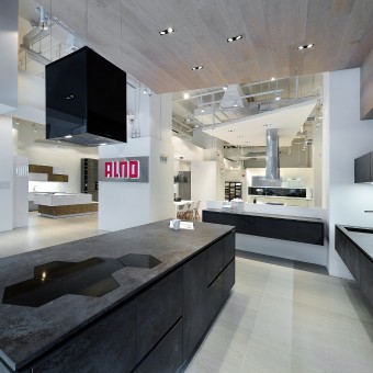
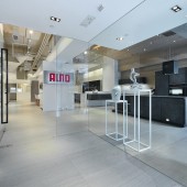
Being different is always the best way to differentiate yourself from others. The showroom of ALNO, a famous German kitchen appliance manufacturer, picks this strategy to outstand itself form the environment. The showcase exercises excellent contrasting design to perform the individualities of the brand and each collection. The contradictory to the old city highlights the simple and stylish masterpiece of the brand.
OPERATION / FLOW / INTERACTION:
-
PROJECT DURATION AND LOCATION:
-
FITS BEST INTO CATEGORY:
Interior Space and Exhibition Design
|
PRODUCTION / REALIZATION TECHNOLOGY:
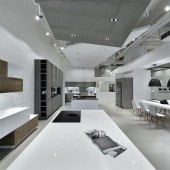
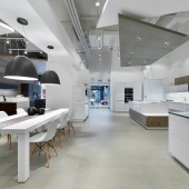
Who will expect a modern and stylish German kitchen appliance showroom in an old and long-developed area of the city? There are no sky scrapers, buildings are old and poorly managed. The designer makes a great contradiction by using a protruding sign make up of dark-grey black gypsum board. The company logo is marked separately on an outstanding white aluminum panel on top of the gypsum board. The inconsistenc naturally make the showroom the most eye-catching spot within the area. Take a look from the full-height glass panel. You can see the place is clearly divided into different areas, each showing a signature collection under the brand. Move your sight up on the ceiling, the designer have not left it blank. He use different irregular quadrilaterals at different heights to identify one collection from the others. Each of the quadrilaterals is just as neat as the minimal and seamless design of the brand. They create different layers for the ceiling and improve the sense of space. Each section is well-defined yet closely connected. Dark colors and metals are always associated with cold and sharpness. But the designer gives them a different perception by preparing a different background. A light-toned and raw wooden laminate wall covering is apply in the section of the Alnostar Cara area in contrast to the dark grey ceramic cabinet to soften the image of the product at the eyes of the audience. The designer also inspired by the choice of materials of the products. One of the highlighted collection is a combination of bright white and elegant shingle effect, he cover that part with white bricks. It works well in supporting the product but at the same time will not overwhelming.
SPECIFICATIONS / TECHNICAL PROPERTIES:
-
TAGS:
-
RESEARCH ABSTRACT:
-
CHALLENGE:
-
ADDED DATE:
2014-02-27 03:52:39
TEAM MEMBERS (1) :
Comodo Interior Design - Alain Wong
IMAGE CREDITS:
Alain Wong, 2013.
|
