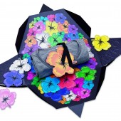
MarceloLopesDesign gift Self promotional Design by Marcelo Lopes |
Home > Winners > #32853 |
 |
|
||||
| DESIGN DETAILS | |||||
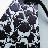
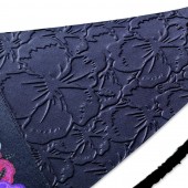
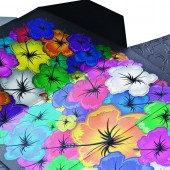
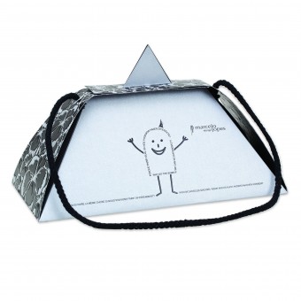
| DESIGN NAME: MarceloLopesDesign gift PRIMARY FUNCTION: Self promotional Design INSPIRATION: The need to create promotional material for an advertising agency led the design process to also include environmental awareness, thereby avoiding the unnecessary consumption of paper. Inspiration also came from Brazilian joy and the colors of its flora. Because our agency is focused on the premium and luxury markets, our purpose was to show our designs can be both fun and playful, this is how the funny mascot was designed to contrast with the sophistication of the package. UNIQUE PROPERTIES / PROJECT DESCRIPTION: This project emphasizes space reduction for package storage purposes, increasing awareness on material consumption and the high quality of the print, with the use of several graphic resources. It is also worth mentioning how easy it is to assemble the package. It only takes a few seconds. Thanks to the use of different graphic resources, we managed to communicate feelings and emotions, thus enhancing both vision and tact. OPERATION / FLOW / INTERACTION: Package project reinforces space use for storage purposes. Easy to assemble. Can be closed in two different ways, thus enabling interaction with both male and female target. It is worth mentioning that the packages structural design accepts several graphic design projects on the surface. The specific case of the promo material for the advertising agency, our purpose was to show not only the structural design but the different graphic resources that together result in a visual impact pack design. PROJECT DURATION AND LOCATION: Project design lasted for two months and another third days to produce the packages. FITS BEST INTO CATEGORY: Graphics, Illustration and Visual Communication Design |
PRODUCTION / REALIZATION TECHNOLOGY: The package was developed with special paper with impasto and several graphic resources: offset printing, hot stamping printing, embossing and dry cut. SPECIFICATIONS / TECHNICAL PROPERTIES: Open package 94 cm x 56 cm and closed package 32 x 21 x 22 cm. We compared the use of space with the open package: while approximately two hundred seventeen traditional boxes may be stored in 1 square meter, this package provided for the storage of approximately six hundred boxes. TAGS: design, interactive, sensorial, ludic, sensorial design, emotion design, transforming emotion into design, marcelo lopes designer, stationery, brasil, São Paulo, innovation, packaging RESEARCH ABSTRACT: The research for this package design was largely focused on paper tests. We wanted the flowers to have a largely metallic effect and nevertheless have lively colors. Depending on the type of paper, even if it were metallic, the colors lost shine in the offset print. We tested on eight different types of paper to achieve the intended result, which also called for the use of metallic ink. CHALLENGE: Greatest challenge in this package was managing to ensure the embossing hit perfectly on the hot-stamping print. Other issue was the embossing volume on the flowers, which had to be apparent. Because of the high weight of the paper, at first it was hard. We developed a new embossing matrix to achieve the result. In order to complete the production process of this design, the lateral flaps were glued onto the base of the box to create another overlapping. The package had to be largely sensorial. ADDED DATE: 2014-02-21 04:36:59 TEAM MEMBERS (1) : Marcelo Lopes, Ivan Bersati IMAGE CREDITS: Sérgio Guerini |
||||
| Visit the following page to learn more: http://merchan-design.com.br | |||||
| AWARD DETAILS | |
 |
Marcelolopesdesign Gift Self Promotional Design by Marcelo Lopes is Winner in Packaging Design Category, 2013 - 2014.· Read the interview with designer Marcelo Lopes for design MarceloLopesDesign gift here.· Press Members: Login or Register to request an exclusive interview with Marcelo Lopes. · Click here to register inorder to view the profile and other works by Marcelo Lopes. |
| SOCIAL |
| + Add to Likes / Favorites | Send to My Email | Comment | Testimonials | View Press-Release | Press Kit |
Did you like Marcelo Lopes' Packaging Design?
You will most likely enjoy other award winning packaging design as well.
Click here to view more Award Winning Packaging Design.


