Brieven Piazza Public Square by Dalia Sadany |
Home > Winners > #32232 |
 |
|
||||
| DESIGN DETAILS | |||||
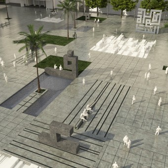
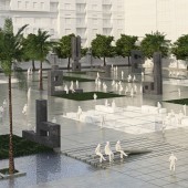
| DESIGN NAME: Brieven Piazza PRIMARY FUNCTION: Public Square INSPIRATION: The stimulation and inspiration behind this abstract design is the overwhelming affection for the simplicity and insight of Piet Mondrian abstraction and symbolism with a touch of character and authenticity denoted in the historic Square Kufic calligraphy. UNIQUE PROPERTIES / PROJECT DESCRIPTION: This design is a manifestation of coherent fusion between styles advocating the message that there is a possibility of mixing different seemingly contradictory style regarding the naked eye observation while when digging deep into the philosophy behind them there would be similarities that would result in a coherent artwork that is appealing beyond obvious comprehension. It is an amalgamation of the impressionism and abstraction with elaboration and extravagance. OPERATION / FLOW / INTERACTION: Abstract landscape on Mondrian style layout providing space for strolling with abstract public art furniture for seating. PROJECT DURATION AND LOCATION: Initiated in June 2013, the research and conceptual trials prolonged till December 2013 after which the phase of architectural detailed drawings to include layout, plans, elevations and sections began. The workshop and technical drawings and the rest of the detailed sets of drawings will be terminated by March 2014. |
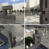
PRODUCTION / REALIZATION TECHNOLOGY: - SPECIFICATIONS / TECHNICAL PROPERTIES: Viewed from above a parallel dimension can be observed that links the piazza to the Mondrian pattern. A closer look reveals a much complex design where the rectangular sculptures displayed under a layer of transparent reinforced triple layered security glass underground. Green grass rectangles each represents one half of the area of the glass sculpture have been distributed randomly around the piazza in a spirit to incorporate Mondrian's own idea of inspiration which is the presentation of nature. The abstract forms of sculptures above the ground of Arabic Kufic letters that works as a liaison between the cubism of the layout and the underground sculptures and the ethnic touch of Arabic font which is the only type that lacks curves, ornamentation and extravagance to a more impressionist abstract approach that is historically known for its combination into geometrical combination that embodies the use of a line, square and it’s multiples into rectangles. TAGS: Mondrian, Calligraphy , Islamic, Ethnic, Oriental, Eclectic, Abstract, Minimalism, Cubism, Kufic, Piazza, Landscape, Public space, Monuments RESEARCH ABSTRACT: The predicament of blending and interfacing impressionism and abstraction mirrored in the essence of art works by Piet Mondrian’s patterns and the rich Islamic flair manifested in the huge Square Kufic letters which resulted in the eclectic yet interactive open public space. That was an opportunity for us to implement a long desired aim and aspiration to amalgamate these two diversified styles and maintain an uninhibited sense and awareness of fusion between these themes. Each of these trends is distinctive in its features, ideologies, presentations and characteristics. As a matter of fact one could evidently declare that these styles are utterly contradictory in their core and fundamental characteristics. It seems at first that these trends virtually have no resemblance or common grounds yet when one excavates deep similarities emerge. CHALLENGE: The attempt to introduce an Islamic feature and the abstract approach of Mondrian’s methodology is a tricky job. Each of these trends is distinctive in its features, ideologies, presentations and characteristics. As a matter of fact one could evidently declare that these styles are utterly contradictory in their core and fundamental characteristics. The objective was not to superficially cut and paste elements and compositions from Islamic and minimalist trends in a shallow collage. The ordeal was to profoundly and meticulously study each style and attempt to blend harmoniously without undermining one in favor of the other nor to excessively exaggerate one existence .The responsibility of risking to tarnish each and its individuality was grueling yet the result was exhilarating. ADDED DATE: 2014-02-03 14:44:17 TEAM MEMBERS (2) : Dalia Sadany and Dezines Team IMAGE CREDITS: Dalia Sadany, 2013. |
||||
| Visit the following page to learn more: http://daliasadany.blogspot.com/ | |||||
| AWARD DETAILS | |
 |
Brieven Piazza Public Square by Dalia Sadany is Winner in Landscape Planning and Garden Design Category, 2013 - 2014.· Read the interview with designer Dalia Sadany for design Brieven Piazza here.· Press Members: Login or Register to request an exclusive interview with Dalia Sadany. · Click here to register inorder to view the profile and other works by Dalia Sadany. |
| SOCIAL |
| + Add to Likes / Favorites | Send to My Email | Comment | Testimonials | View Press-Release | Press Kit | Translations |
Did you like Dalia Sadany's Landscape Design?
You will most likely enjoy other award winning landscape design as well.
Click here to view more Award Winning Landscape Design.


