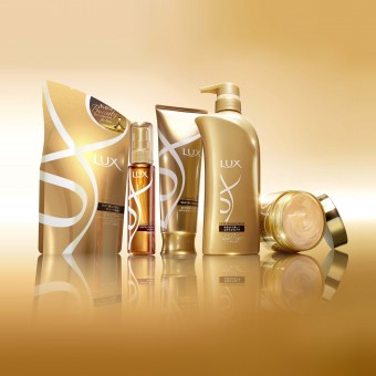
DESIGN NAME: Lux re-launch
PRIMARY FUNCTION: Haircare range
INSPIRATION: We wanted the new Lux packs to stand out from the crowd - to have stand out on shelf with strong visibility and clear differentiation from the cluttered market environment without losing the core essence of the Lux brand. We also wanted to enable shoppers to navigate the range easily. Key objectives were also to move the brand to a more premium position and to bring the Japanese and Chinese ranges in line together with a consistent Lux logo.
UNIQUE PROPERTIES / PROJECT DESCRIPTION: By taking the strong equity of the LUX brand identity, JDO created a new and highly animated device by way of the ribbons marque. The gold ribbons reflect pure glamour, ooze confidence and luxury and are both bold and impactful. The two sub ranges of Shine and Damage Repair are easily differentiated through the base pack colour with pink and bronze highlights. On shelf the LUX range combats the clutter with an elegant and refined presence.
OPERATION / FLOW / INTERACTION: Unilever now has a Lux range which has real standout within the absolute chaos on shelf. The range is easy for consumers to navigate with clear differentiation between the Shine and Damage repair ranges and the shampoo and conditioner products. The white & gold are impactful and Lux now 'owns' a strong brand colour. Our client said, "JDO’s design is simple, modern and ownable, while the ribbons marque has iconic potential and is highly campaignable. The contemporary play on LUX gold equity is not only modernising the brand but also moving it to a more distinct and premium position.”
PROJECT DURATION AND LOCATION: The project started in April 2012 and finished in December 2012. Initial launch was in September 2013 in Japan and China.
FITS BEST INTO CATEGORY: Packaging Design
|
PRODUCTION / REALIZATION TECHNOLOGY: Our packs needed real standout within the absolute chaos on shelf. Attaining a premium feel whilst not being able to have everything on our production 'wish list' was a real challenge. Achieving impactful branding within the label print areas and the size and area of the gold foiling for the Lux ribbons were both production challenges. The cost of the shiny gold elements such as the lids were extremely expensive and trying to achieve a satisfactory gold rather than a yellow colour for the plastic substrate bottles was also very hard work.
SPECIFICATIONS / TECHNICAL PROPERTIES: -
TAGS: JDO, Unilever, Japan, China, Haircare, Lux, Shine, Damage, Luxury, Glamour
RESEARCH ABSTRACT: -
CHALLENGE: One of our major challenges was to 'sell in' the ribbon device. The client wanted reassurance that it would be an ownable brand equity and act as a direct reflection of the Lux logo. We explained that it didn't have to look exactly like ribbons and that it was in fact a piece of vertical branding. We also pushed to achieve as close to a real gold colour as possible within production constraints. We believed that white & gold could be as impactful as a strong colour like competitor Shisedo's red. At that time Lux didn't 'own' a strong colour. A clear differentiation between the Shine and Damage ranges and the Shampoo and Conditioner products was also key. Aligning Japan and China with the same design also proved challenging - the design needed to appeal in equal measure to both markets.
ADDED DATE: 2014-01-08 03:38:45
TEAM MEMBERS (6) : Ben Oates, Sara Faulkner, Robyn Stevenson, Melanie Wilson, James Davies and
IMAGE CREDITS: JDO Brand Design & Innovation, 2013.
|