ZODIAC Pan-Asian Bistro Pan-Asian Bistro by ARCHPOINT |
Home > Winners > #31721 |
 |
|
||||
| DESIGN DETAILS | |||||
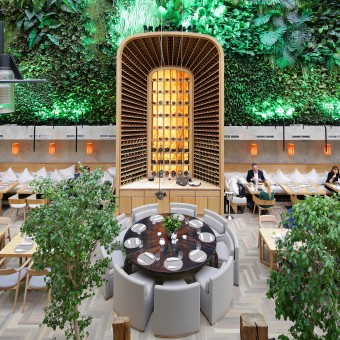
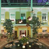
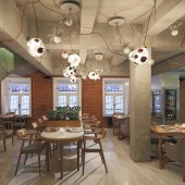
| DESIGN NAME: ZODIAC Pan-Asian Bistro PRIMARY FUNCTION: Pan-Asian Bistro INSPIRATION: The customer’s idea is to create a designer bistro in a covered area between a historical mansion and mall’s wall. UNIQUE PROPERTIES / PROJECT DESCRIPTION: A room for the restaurant is located in quite a complex covered space – between the face of a historical mansion and mall’s solid glass wall 12 m high. The total area under design is 380 sq.m, including premises of the mansion that also house the kitchen and all engineering and utility services rooms. One of the core ideas of the project is landscaping of the wall 12 m high and 168 sq.m in area. It will blossom, emit scents, breathe, grow old and change its appearance. It grows all kinds of plants and Moscow guests will certainly be delighted to find themselves in these jungles amidst a Russian winter. This art object is complemented by provocative postmodern interiors of the restaurant. The VIP hall situated in the old-time mansion and finished with concrete is very demonstrative in this respect. This is a bolt from the blue for a Moscow’s premium restaurant. It is no wonder that visitors do not believe that the premises are ready for service. Expensive species of natural wood and stone in finish are combined with the harsh concrete touch of the walls and ceiling. This contrast is intensified by the curved lines of exposed wiring copper pipes. Exposed concrete has been used in the manufacture of architectural elements – bar, WC, columns, etc. Minimalist furniture made of light oak (Maruni, Japan), ceiling lamps used as plant pots (Bocci, Italy) and concrete structure of the bar add to the interior. This concrete structure is perceived as an art object, as is the case with a giant five-meter-long wine and tea portal cabinet in the principal hall. This custom-built cabinet reminds of a high bookstack with a ladder. This wine portal arch is visually backed up by mosaic boards suspended over the tables, a large round table (Heron Pagini Italia) with a metal top and round sofa and somewhat ironical armchairs by Andreu World (Italy). The furniture does not have an in-your-face style; it is rather perceived in its quality. It features a slight inclination towards the futuristic style of 1960s. General style of the premises evokes a sensation of verve of today’s trends in European design. Open and modernistic at the same time, thorough in details, it is designed to please the most demanding customers. OPERATION / FLOW / INTERACTION: The idea was to open a pan-asian modern restaurant with author's cuisine with an interior simple as it can be, but attractive as it can be as well. We used only compact and simple decisions, only natural materials, only simple forms. The cusine and the interior works together. PROJECT DURATION AND LOCATION: The project started in February 2013, cafe opened in December 2013. Location: SMOLENSKIY PASSAGE Class A Retail and Business Complex situated in the historical center of Moscow. Smolenskaya square‚ 3 (1st floor) FITS BEST INTO CATEGORY: Interior Space and Exhibition Design |
PRODUCTION / REALIZATION TECHNOLOGY: The main thing to pay attention at, is the concrete bar station, which works as a bar from its one side and as a wash-stand from the other. The construction was made from light concrete. The real fabric was used like a mould to make a surface looks like a concrete fabric. The encaustic was used to make the bar water resistant. 3d model was made first and then the skills of a sculptor made it real. The other thing is a plant green wall, made from real and artificial flowers both. It gives the sense of relax and comfort in open space. The next thing is custom made wine cabinet. Its oversized dimensions empress. SPECIFICATIONS / TECHNICAL PROPERTIES: total area - 420m - cafe area - 220m kitchen area - 200m number of seats - 115 TAGS: cafe, restaurant, gastro boutique, pan-asian bistro, bistro, pan-asian RESEARCH ABSTRACT: - CHALLENGE: The hardest thing was to create a restaurant from the trade center hall. The space itself was interesting and difficult at the same time. It should be a separate space in a public area. We did it! ADDED DATE: 2013-12-26 05:35:47 TEAM MEMBERS (4) : Valery Lizunov - chief architect, workshop leader, Sergey Briukhanov - architect, Alexandra Shemetillo - architect and Ekaterina Ageeva - decorator IMAGE CREDITS: ARCHPOINT, 2013. |
||||
| Visit the following page to learn more: http://www.zodiacmoscow.ru/ | |||||
| AWARD DETAILS | |
 |
Zodiac Pan-Asian Bistro Pan-Asian Bistro by Archpoint is Winner in Interior Space and Exhibition Design Category, 2013 - 2014.· Read the interview with designer ARCHPOINT for design ZODIAC Pan-Asian Bistro here.· Press Members: Login or Register to request an exclusive interview with ARCHPOINT. · Click here to register inorder to view the profile and other works by ARCHPOINT. |
| SOCIAL |
| + Add to Likes / Favorites | Send to My Email | Comment | Testimonials | View Press-Release | Press Kit |
Did you like Archpoint's Interior Design?
You will most likely enjoy other award winning interior design as well.
Click here to view more Award Winning Interior Design.


