Illusion Website by Adriana de Barros |
Home > Winners > #31501 |
 |
|
||||
| DESIGN DETAILS | |||||
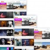
| DESIGN NAME: Illusion PRIMARY FUNCTION: Website INSPIRATION: We wanted to launch a short-publication website focused on art and design, especially dedicated to optical illusions and trick photos. Illusion is inspired by magic tricks and art displayed around the world. UNIQUE PROPERTIES / PROJECT DESCRIPTION: Illusion is an art, design and film website. Featuring the most amazing artistic creations from around the globe. The project was recently redesigned with a fully responsive layout. We follow the motto: less is more, and keep our site design minimalist and functional for viewers. OPERATION / FLOW / INTERACTION: The idea was to make a practical website. Although we could make an artistically complex and out-of-this-world site, we prefer to keep things simple so that the articles are a primary focus and readers can find content and navigate with ease. Visual functionality is important to us. We also used colors to divide the site, per titles and also using white background to create a clean and spacious environment. Many websites tend to be cluttered, and we wanted to create a sense of "ahhhh" relief to the reader that this a clean site. PROJECT DURATION AND LOCATION: Site Development: July 15th, 2013 to August 20th, 2013. |
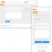
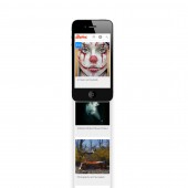
PRODUCTION / REALIZATION TECHNOLOGY: The design mockups were done in Photoshop, showing each screen size. There were about 6 dimensions (from 320px, 728px, to 1280px 2500px). It was fully coded with HTML5, CSS3 and Javascript. SPECIFICATIONS / TECHNICAL PROPERTIES: It is re-sizable for desktop computers, tablet and smartphones. TAGS: art, website, design, responsive, site, illusion RESEARCH ABSTRACT: We had the site already up and running, so basically over the course of 6 months reviewed with Clicky counter (heat maps), which sections of the site readers would click on. We kept sections of the site that worked, and what didn't was gradually removed. We checked popular screen sizes. Did surveys with readers to understand what they liked and didn't, and basically upgraded the full site with this redesign. We also simplified a lot, in terms of navigation, adding a load more article button, less ads, etc. CHALLENGE: Responsive (re-sizeable) websites are something new, so it presents a challenge when it is a bit unknown to a designer or developer. It required doing research, seeing other site examples. It took a few years to envision some of the changes to the site, and only in the summer did we begin working on the project development. The site was fully re-coded. There were new features added that didn't work well on the first try, and then they were re-coded and re-tested. Design-wise it was more about upgrading/improving the site, then making a completely different look that may confuse readers. Some of the challenges were how to incorporate the advertising banners that were not supposed to be re-sizable for ad standards, yet make the site stretchable and looking good. ADDED DATE: 2013-11-29 10:10:36 TEAM MEMBERS (2) : Designer Adriana de Barros and Developer Ron Zvagelsky IMAGE CREDITS: Website Design and Development (Scene 360) Artwork thumbnails (copyright respective artists/owners) |
||||
| Visit the following page to learn more: http://illusion.scene360.com/ | |||||
| AWARD DETAILS | |
 |
Illusion Website by Adriana De Barros is Winner in Digital and Broadcasting Media Design Category, 2013 - 2014.· Read the interview with designer Adriana de Barros for design Illusion here.· Press Members: Login or Register to request an exclusive interview with Adriana de Barros. · Click here to register inorder to view the profile and other works by Adriana de Barros. |
| SOCIAL |
| + Add to Likes / Favorites | Send to My Email | Comment | Testimonials | View Press-Release | Press Kit | Translations |
Did you like Adriana De Barros' Media Design?
You will most likely enjoy other award winning media design as well.
Click here to view more Award Winning Media Design.


