Noritake E-Cormmerce Website by Jade Choi |
Home > Winners > #30938 |
 |
|
||||
| DESIGN DETAILS | |||||
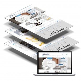
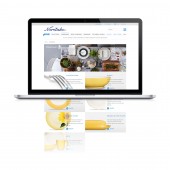
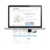
| DESIGN NAME: Noritake PRIMARY FUNCTION: E-Cormmerce Website INSPIRATION: Growing up in South Korea, I was raised in an Oriental Culture which was, by nature, simple and elegant. This e-commerce website featured fine china and oriental dinnerware. This reminded me of the elegant and simple culture in which I was raised. I designed this website with a goal in mind: to focus on the simplistic and beautifully spacious feel of oriental culture. UNIQUE PROPERTIES / PROJECT DESCRIPTION: Made a year ago, this was a flagship flat design project when flat design was not trending. This design features tile-formatting for products & the whole site's grid system. I also created the unique branding in the footer with subtle, yet detailed typography. This website concept was to create a simple, elegant design that made sense using appropriate whitespace and flat design elements. OPERATION / FLOW / INTERACTION: While hovering your cursor over the product listings, you'd notice that it would zoom in and show you a better view of the product. On the home page, you may also notice a custom slider, showing various products on the website. In the gallery, if you hover over the "view" icons (Plus signs inside of circles), you'd reveal a viewing of that specific product. I.E. there'd be an image beautifully showing several products at once. If you liked a specific product in the image you could hover over it and add it to your cart. PROJECT DURATION AND LOCATION: I started designing the UI in the beginning of August, 2012. This project only took me about two months, and was finalized in October, 2012. |
PRODUCTION / REALIZATION TECHNOLOGY: For the majority of this design, I utilized Photoshop's internal grid system to set up the over all UI feel. I then used adobe Illustrator to help create the uniquely styled footer for the website's branding purposes. I decided to not style the websites as most other designers were doing because I felt that a skeuomorphic feel would not be an appropriate approach to the simple and elegant feel I was aiming for. I decided to go with a flat interface which would be easy to use and correctly solve the design challenges I was facing. SPECIFICATIONS / TECHNICAL PROPERTIES: Width of content: 960px; Using a 12 column internal grid system TAGS: flat design, elegance, simplistic, oriental, minimal, clean, modern RESEARCH ABSTRACT: - CHALLENGE: The main obstacle was to create an informative, creative and yet simplistic design to replicate the elegance shown in oriental culture. I decided to go "against the grain" and take a simple, modern, and flat design approach to tackle this problem. ADDED DATE: 2013-09-30 09:20:37 TEAM MEMBERS (1) : IMAGE CREDITS: Jade Choi, 2013. |
||||
| Visit the following page to learn more: http://www.behance.net/howeveriam | |||||
| AWARD DETAILS | |
 |
Noritake E-Cormmerce Website by Jade Choi is Winner in Website and Web Design Category, 2013 - 2014.· Read the interview with designer Jade Choi for design Noritake here.· Press Members: Login or Register to request an exclusive interview with Jade Choi. · Click here to register inorder to view the profile and other works by Jade Choi. |
| SOCIAL |
| + Add to Likes / Favorites | Send to My Email | Comment | Testimonials | View Press-Release | Press Kit | Translations |
Did you like Jade Choi's Web Design?
You will most likely enjoy other award winning web design as well.
Click here to view more Award Winning Web Design.


