Casa Golf Exhibition space by Dado Castello Branco |
Home > Winners > #30624 |
 |
|
||||
| DESIGN DETAILS | |||||
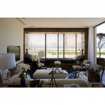
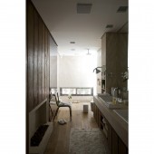
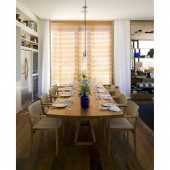
| DESIGN NAME: Casa Golf PRIMARY FUNCTION: Exhibition space INSPIRATION: The initial idea was to create, in an exhibition space, a contemporary country house for a couple of more or less 100 m². We wanted to create a space that would feel like home; a relaxed and bright setting with country like details. We wanted to focus on well chosen furniture and specific details that we knew people would notice. We had the idea of using blue throughout the project and a discrete use of plaid so to bring out the country house style. Wood would be used to warm up the space while the use of stone would cool it down; to create balance. UNIQUE PROPERTIES / PROJECT DESCRIPTION: The exhibition space contained a living room, a kitchen, a bedroom, a terrace and a small garage for a golf cart, all in 100 m². The contemporary architecture allowed for rustic details such as the use of stone together with the demolition wood and natural fabrics such as linen. We used blue tones on furniture, on decorative elements and on curtains, giving the space a thorough consistency. For the space to have a balanced ambience, we had contemporary art in contrast with the vintage furniture. OPERATION / FLOW / INTERACTION: Due to the limited area of the exhibition space, there was intentionally open spaces that fit two uses into one. PROJECT DURATION AND LOCATION: This project was made for a show, Casa Cor at São Paulo. It started in May 2008 and finished in July 2008. FITS BEST INTO CATEGORY: Interior Space and Exhibition Design |
PRODUCTION / REALIZATION TECHNOLOGY: Demolition wood, stone, upholstered furniture, natural leather, personal objects as details. SPECIFICATIONS / TECHNICAL PROPERTIES: Inside area: approximately 137 m² Terrace: approximately 55 m² TAGS: Casa Cor, Interior design , country house, contemporary art, vintage furniture RESEARCH ABSTRACT: Dado went after the idea of a country house, the materials used for construction and materials used for the interiors. Following this premise, Dado used rustic materials to portray a comfortable tone. CHALLENGE: The hardest part in creating this exhibition space was the limits that the exhibition fair gave each architect. Dado had to come up with the idea of what to construct but at the same time restricting himself to the limits and to the construction already present that he had to desguise. ADDED DATE: 2013-09-27 12:56:58 TEAM MEMBERS (1) : Nicole Conrad, Tita Shinohara, Dado Castello Branco IMAGE CREDITS: Dado Castello Branco, 2013. |
||||
| Visit the following page to learn more: http://www.dadocastellobranco.com.br/ | |||||
| AWARD DETAILS | |
 |
Casa Golf Exhibition Space by Dado Castello Branco is Winner in Interior Space and Exhibition Design Category, 2013 - 2014.· Read the interview with designer Dado Castello Branco for design Casa Golf here.· Press Members: Login or Register to request an exclusive interview with Dado Castello Branco. · Click here to register inorder to view the profile and other works by Dado Castello Branco. |
| SOCIAL |
| + Add to Likes / Favorites | Send to My Email | Comment | Testimonials | View Press-Release | Press Kit |
Did you like Dado Castello Branco's Interior Design?
You will most likely enjoy other award winning interior design as well.
Click here to view more Award Winning Interior Design.


