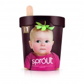
Sprout Baby food brand by Springetts Brand Design Consultants |
Home > Winners > #29955 |
 |
|
||||
| DESIGN DETAILS | |||||
| DESIGN NAME: Sprout PRIMARY FUNCTION: Baby food brand INSPIRATION: Our hope would be that the aesthetic of the concept would reassure through the promise of natural goodness, but that the image and idea would engage emotionally – making mums smile; creating a powerful on-shelf presence. UNIQUE PROPERTIES / PROJECT DESCRIPTION: A brand idea, which seeks to break new ground in the baby food category by the introduction of a fresh, chilled range of part-prepared baby food, similar to formats available for adult consumption. This would allow mums to make their ‘own’ baby food easily and quickly. The concept name is intended to convey the integrity of the ingredients and how the right food is key to healthy development. Building on this idea, the creative execution is a playful, literal expression of ‘you are what you eat’. The intention to present an image of baby as happy, healthy and flourishing with the help of nature’s best ingredients. Reassuring through the promise of natural goodness, with and image and idea to engage emotionally – making mums smile; creating a powerful on-shelf presence. OPERATION / FLOW / INTERACTION: - PROJECT DURATION AND LOCATION: London FITS BEST INTO CATEGORY: Packaging Design |
PRODUCTION / REALIZATION TECHNOLOGY: Created in-house as a concept for a baby food project. SPECIFICATIONS / TECHNICAL PROPERTIES: - TAGS: Baby food, concept RESEARCH ABSTRACT: - CHALLENGE: Overcoming the challenges of a stagnant baby food market. ADDED DATE: 2013-09-05 02:36:34 TEAM MEMBERS (2) : Moyra Casey and Kelly Bennett IMAGE CREDITS: Springetts Brand Design Consultants, 2013. |
||||
| Visit the following page to learn more: https://www.springetts.co.uk | |||||
| AWARD DETAILS | |
 |
Sprout Baby Food Brand by Springetts Brand Design Consultants is Winner in Packaging Design Category, 2013 - 2014.· Read the interview with designer Springetts Brand Design Consultants for design Sprout here.· Press Members: Login or Register to request an exclusive interview with Springetts Brand Design Consultants. · Click here to register inorder to view the profile and other works by Springetts Brand Design Consultants. |
| SOCIAL |
| + Add to Likes / Favorites | Send to My Email | Comment | Testimonials | View Press-Release | Press Kit |
Did you like Springetts Brand Design Consultants' Packaging Design?
You will most likely enjoy other award winning packaging design as well.
Click here to view more Award Winning Packaging Design.


