Power Lunch Chilled Fish Lunch Solutions by Springetts Brand Design |
Home > Winners > #28790 |
 |
|
||||
| DESIGN DETAILS | |||||
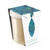
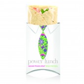
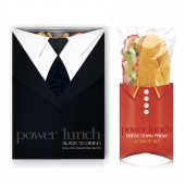
| DESIGN NAME: Power Lunch PRIMARY FUNCTION: Chilled Fish Lunch Solutions INSPIRATION: We wanted to look at ways to increase fish consumption in the UK, particularly at lunchtime or when 'on the go'. Because of the proposed price premium, we thought busy City workers were a key target. We wanted to connect their needs to the health benefits of fish in an engaging and impactful way. UNIQUE PROPERTIES / PROJECT DESCRIPTION: A range of lunch solutions - all containing fish - aimed at busy city workers looking for fast, healthy and inspiring food. The 'Power Lunch' name is a play on the business cliché and intended to convey the nutritional power of fish. The creative execution holds a tongue-in-cheek 'mirror' up to our proposed consumer and the 'kipper tie' highlights the fish content and the recipe through choice of pattern and colours. The 'black tie' and 'dress down Friday' routes were thoughts to further brand engagement as limited edition offers. OPERATION / FLOW / INTERACTION: The shirt and tie motif running across the concept design is intended to be a playful and emotionally engaging brand signal that would shout from the shelves to city workers that it was designed especially for them. The idea of limited edition 'black tie' meals as a special treat or the polo shirt to signal a more 'casual ' snack helps further build brand engagement PROJECT DURATION AND LOCATION: - FITS BEST INTO CATEGORY: Packaging Design |
PRODUCTION / REALIZATION TECHNOLOGY: This is a concept design but the intended materials would be carton board, flow wrap inserts and matt black plastic trays for the ready meal range. The shirt collars would be physically constructed with folds in the carton board construction. The reverse side of the packaging would be printed with the fabric textures. The 'shirt' fronts would not be sealed on ready meals but 'flap' open in centre for consumers to view food. SPECIFICATIONS / TECHNICAL PROPERTIES: The sizes would be standard, single serve wraps , sandwich and ready meal formats. TAGS: fish, lunch, city workers, snacks, healthy eating RESEARCH ABSTRACT: The concepts underwent qualitative testing along with several other ideas. CHALLENGE: To create a range of products where fish was the hero in a market where the protein of choice is chicken. To bring this to life in a way that we believed would disrupt and cut through in the few seconds it takes for our proposed consumer to make their choice. To communicate the benefits of fish in an inspiring and engaging way through the design rather than around it. ADDED DATE: 2013-03-04 09:05:44 TEAM MEMBERS (2) : Designer: Moyra Casey and Creative Director: Moyra Casey IMAGE CREDITS: Springetts Brand Design, 2012. |
||||
| Visit the following page to learn more: http://www.springetts.co.uk | |||||
| AWARD DETAILS | |
 |
Power Lunch Chilled Fish Lunch Solutions by Springetts Brand Design is Winner in Packaging Design Category, 2012 - 2013.· Read the interview with designer Springetts Brand Design for design Power Lunch here.· Press Members: Login or Register to request an exclusive interview with Springetts Brand Design. · Click here to register inorder to view the profile and other works by Springetts Brand Design. |
| SOCIAL |
| + Add to Likes / Favorites | Send to My Email | Comment | Testimonials | View Press-Release | Press Kit |
Did you like Springetts Brand Design's Packaging Design?
You will most likely enjoy other award winning packaging design as well.
Click here to view more Award Winning Packaging Design.


