Coca-Cola 125 years of design Exhibition by Pinkeye |
Home > Winners > #28713 |
 |
|
||||
| DESIGN DETAILS | |||||
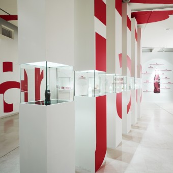
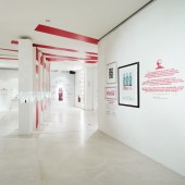
| DESIGN NAME: Coca-Cola 125 years of design PRIMARY FUNCTION: Exhibition INSPIRATION: The inspriration came from the poster announcing the exhibition, showing only the Coca-Cola logo, the title and the evolution of the Coca-Cola bottle. We wanted to recreate this simplicity into the exhibition space. Another thing that matched this idea was that the effect would be that the visitor would be confronted with only fragments of the Coca-Cola logo throughout the tour, proving that this is one of the world's most recognized logos. UNIQUE PROPERTIES / PROJECT DESCRIPTION: Coca-Cola Atlanta in cooperation with Coca-Cola Belgium asked Pinkeye to design this 450m2 exhibition about the rich history of 125 years of Coca-Cola as a design innovator. Showcasing many of the diverse artefacts collected by Coca-Cola proved challenging due to the sheer volume of elements at hand. We established a strong coherent unity by drawing up a clear message track and translating this into a spatial form. The moment visitors enter the main space they are met with a gigantic Coca-Cola logo seemingly filling up the whole room, breaking up into smaller intricate but always recognisable fragments as the visitors explore the exhibition. 5 main themes were connected literally by a red line, guiding people throughout the key content. OPERATION / FLOW / INTERACTION: Pinkeye designed this exhibition in its entirety, from content organisation to spatial design, furniture, graphics and even interactive games about Coca-Cola shown on a number of iPads - this allowed schools and teenagers to experience a fresh and challenging show about what Coca-Cola has meant to designers and consumers during the past 125 years. PROJECT DURATION AND LOCATION: Design lasted 1 month, during August 2011.The selection and sourcing of different items took us 3 months, from August until November 2011. Production happened in the month of November, 2011. The exhibition lasted from December 2011 until Ferbruary 2012. FITS BEST INTO CATEGORY: Interior Space and Exhibition Design |
PRODUCTION / REALIZATION TECHNOLOGY: Painting and stickering a projected image onto the white exhibition space's walls, ceiling and floor. SPECIFICATIONS / TECHNICAL PROPERTIES: 500 sq.m TAGS: Exhibition, Coca-Cola, Design, Projection, Distortion RESEARCH ABSTRACT: - CHALLENGE: The challenge was in the idea to keep all items hidden when entering the space and revealing them step by step. The positioning of the separation walls and furniture had to allow the logo and title to be projected and painted on them. ADDED DATE: 2013-03-03 14:36:44 TEAM MEMBERS (1) : Pinkeye IMAGE CREDITS: Pinkeye, 2012. |
||||
| Visit the following page to learn more: http://www.pinkeye.be | |||||
| CLIENT/STUDIO/BRAND DETAILS | |
 |
NAME: The Coca-Cola Company, Belgium PROFILE: - |
| AWARD DETAILS | |
 |
Coca-Cola 125 Years of Design Exhibition by Pinkeye is Winner in Interior Space and Exhibition Design Category, 2012 - 2013.· Read the interview with designer Pinkeye for design Coca-Cola 125 years of design here.· Press Members: Login or Register to request an exclusive interview with Pinkeye. · Click here to register inorder to view the profile and other works by Pinkeye. |
| SOCIAL |
| + Add to Likes / Favorites | Send to My Email | Comment | Testimonials | View Press-Release | Press Kit |
Did you like Pinkeye's Interior Design?
You will most likely enjoy other award winning interior design as well.
Click here to view more Award Winning Interior Design.


