Oscar Opticiens Optician by Pinkeye |
Home > Winners > #28597 |
 |
|
||||
| DESIGN DETAILS | |||||
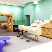
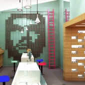
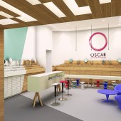
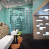
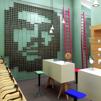
| DESIGN NAME: Oscar Opticiens PRIMARY FUNCTION: Optician INSPIRATION: The duality of standard and sunglasses, and also of the old and new part of the building inspired us to start playing with blurred boundaries and overlapping divisions between the two spaces, with angular coloured surfaces establishing a dynamic and playful basis for us to start filling in the design - and effectively joining the two spaces by downplaying the existing wall UNIQUE PROPERTIES / PROJECT DESCRIPTION: The Grenoble, France based optician Oscar came to us to redesign their store when they annexed the neighbouring building and extended their range of standard glasses with sunglasses. The duality of standard and sunglasses, and also of the old and new part of the building inspired us to start playing with blurred boundaries and overlapping divisions between the two spaces, with angular coloured surfaces establishing a dynamic and playful basis for us to start filling in the design - and effectively joining the two spaces by downplaying the existing wall. The shop’s eye-catcher is a graphic measuring 3.75 metres tall by 3.10 metres across, entirely shaped by 780 sunglasses affixed in holes in the metal partition wall. The image can be altered into any imaginable design, depending on where the sunglasses are placed. Another feature of the design is the wooden corridor connecting the two spaces and simultaneously serving as a display space for the products. OPERATION / FLOW / INTERACTION: The client wanted to be able to change a part of the visual appearance of the store over time.For him this was a very important aspect of getting the attention of the customer. He suggested working with art panels that could be replaced from time to time. We suggested to do something with glasses instead and came up with the adaptable sunglasses visual on the wall facing the window. PROJECT DURATION AND LOCATION: Grenoble, France. The project started in august 2011 and was finished in February 2012 FITS BEST INTO CATEGORY: Interior Space and Exhibition Design |
PRODUCTION / REALIZATION TECHNOLOGY: We wanted the diagonal line that runs over the floor and walls to be a visible and present as possible. In order to achieve this we had to design light-footed furniture, which we liked to contrast with a heavy top. The large sunglasses wall is made out of steel and is covered with pairs of holes to match the glasses' ears. A set of small wooden sticks, painted equally green as the wall itself, with magnets on the ends can be put between each pair of holes to create a 'nose' for the glasses SPECIFICATIONS / TECHNICAL PROPERTIES: 150 sq.m (workplace included) TAGS: Optician, Interior, Retail RESEARCH ABSTRACT: - CHALLENGE: The challenge was to connect the new part (sunglasses) and the old part of the store (optical glasses) and remaining the existing wall cabinets of the old part. Our solution was to create a tunnel piece connecting the both and visually replacing the border between the 2 parts by creating a diagonal line that runs over the floor, cabinets and walls into the old part. ADDED DATE: 2013-03-01 10:22:58 TEAM MEMBERS (1) : Pinkeye IMAGE CREDITS: Pinkeye, 2012. |
||||
| Visit the following page to learn more: http://www.pinkeye.be | |||||
| CLIENT/STUDIO/BRAND DETAILS | |
 |
NAME: Oscar Opticiens PROFILE: - |
| AWARD DETAILS | |
 |
Oscar Opticiens Optician by Pinkeye is Winner in Interior Space and Exhibition Design Category, 2012 - 2013.· Read the interview with designer Pinkeye for design Oscar Opticiens here.· Press Members: Login or Register to request an exclusive interview with Pinkeye. · Click here to register inorder to view the profile and other works by Pinkeye. |
| SOCIAL |
| + Add to Likes / Favorites | Send to My Email | Comment | Testimonials | View Press-Release | Press Kit |
Did you like Pinkeye's Interior Design?
You will most likely enjoy other award winning interior design as well.
Click here to view more Award Winning Interior Design.


