DESIGN NAME:
Foo
PRIMARY FUNCTION:
Home
INSPIRATION:
Open to exploration of new ideas and materials. Before commencing work, we communicated regularly so as to be on the same page.
UNIQUE PROPERTIES / PROJECT DESCRIPTION:
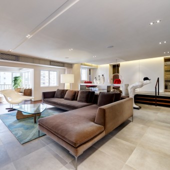
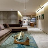
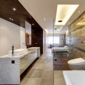
The client is a private person who also wanted a gallery-like space for entertaining and housing her retro-modern furniture and her art work collection. The aim is to achieve an open space that can be modern, yet cozy, simple and elegant. Basic materials such as wood and stone are the key themes. The floors are deliberately uneven, and cement-like, yet there are walls clad in creamy crocodile-look wallpaper. The appearance is neat, seamless, and effortless, belying the fact much consideration went into each detail, especially the extensive concealed storage spaces. Much thought also went into achieving a continuous space with no dead ends - one room leads on to the next, the next, and the next....
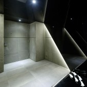
In this apartment, there exist the serious, masculine elements, alongside the playful, humorous elements: one is surprised on entering the lift lobby, to encounter all black marble in a small dark space with low ceiling, that quickly leads on to a brighter area with light grey textures. It is almost like giving guests a 'preview'of what is on the other side of the door, with the concrete-look leading indoors. The playfulness continues with her choice of sculptures and paintings.
The client's 'private' areas of her bedroom, bathroom, and the gym room can be one 800 square-foot space, or three distinct rooms - separated by hidden doors and curtains. Blink and one could miss the walk-in wardrobes, camouflaged behind the metal-like 'tunnel' (floor, wall, and the ceiling clad in same metal-like material), at the entrance to this private space. Large sliding doors once closed, conceal the owner's 'private' space, and guests only left with the 'public' area for their enjoyment. The teak wood in the balcony is a theme that extends from the living room, all through to the bedrooms, running along one side of the apartment. The wood juxtaposes warmly against the concrete and metal.
For this apartment, the owner welcomes her guests to enjoy themselves, while she discreetly protects her privacy.
OPERATION / FLOW / INTERACTION:
-
PROJECT DURATION AND LOCATION:
The project started in March 2012 and finished in December 2013 in Hong Kong.
FITS BEST INTO CATEGORY:
Interior Space and Exhibition Design
|
PRODUCTION / REALIZATION TECHNOLOGY:
-
SPECIFICATIONS / TECHNICAL PROPERTIES:
-
TAGS:
Foo
RESEARCH ABSTRACT:
-
CHALLENGE:
The apartment is a thirty-year old, 3,300 square-foot apartment, up a private road in the Mid-levels, with open views over Central, Hong Kong. It originally had five bedrooms in split-level. The squarish layout, high ceiling and large balcony lend to the potential of the old apartment.
ADDED DATE:
2013-02-20 01:15:07
TEAM MEMBERS (1) :
Eric Leung
IMAGE CREDITS:
Eric Leung, 2012.
|
