DESIGN NAME:
STARLIT LEARNING CENTRE
PRIMARY FUNCTION:
Learning Centre
INSPIRATION:
Starlit Learning Centre is designed to provide performance training in relax learning environment for children age 2-6. Children in Hong Kong are studying under high pressure. This learning centre is designed to create a delightful learning atmosphere with utmost space.
UNIQUE PROPERTIES / PROJECT DESCRIPTION:
Starlit Learning Centre is designed to provide performance training in relax learning environment for children age 2-6. Children in Hong Kong are studying under high pressure. This learning centre is designed to create a delightful learning atmosphere with utmost space.
In order to empower the form & space through the layout and fit various programs, we are applying the Ancient Rome City Planning. Circular elements are common along radiating arms within axis arrangement to chain up the classroom and studios between two distinct wings.
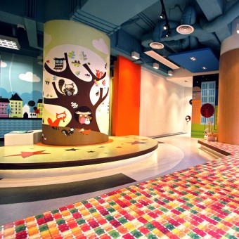
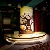
The space design of a 1m-diameter at the centre-point is challenging for the most of designers. To turn obstacles into miracles, it is strategically transformed as a focal point of the learning centre. Like the famous landmark Colosseo, it becomes a performance stage for children acting drama and foundation music instrument. The opposite area acts as an auditorium which is multi-functional and could be transformed between flexible children playground, parent-child interaction platform or parents’ waiting area. Two axes are radiating outward alongside which linking the focal point to others. Circular forms are prioritized on design as it is a familiar shape with them.
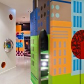
All natural greens nourish children’s passion and happiness. Trees are shelter for little ones with reliable and sense of security. The learning centre is combining the familiar cityscape environment and dreaming landscape to local children. The focal column is dressing with big tree trunk images at main entrance; the floor is covering with wood texture and natural colour tone floor. Walking towards the north wing, the full height cabinet is hiding behind the owls and trees wallpapers. This one sided windows not only bring in natural light but also the greenery scenic, such harmony ambience provides a non-pressure learning environment for children. To symbolic the urban city design, interiors facade was comprised of joyful colour numbers and cartoon skyscraper prints on wall. This city garden is merging the idea from the prototype of Ancient Rome City Planning, with the decorative inspiration of New York Central Park, our detail design concept of learning centre has been defined.
Children’s mood can be easily inspired by surrounding colours. Applying the appropriate palette to create a cheerful yet non over-stimulating learning environment, balancing of colours in hue value and chroma is the key. Analogous and complementary palettes are carefully practiced to create various moods and enhancing the enjoyment. Interesting patterns are printed on wallpaper, sticker, vinyl floor and the bulletin board are creating sequence of scenery and layering along pathway.
Circle is one mother tone of children. “Drawing circles is an integral part of the process of maturation.” (Kellogg, 1967). Round shapes provide a sense of security and safety to children. It generally appears at the early stage of children’s art. The learning centre is using circle to provide children’s self-vision and self-awareness. All reachable circular elements are designed with wide range of materials at floor pattern, wall shelving and reception. These sensory experiences stimulate children to define different zonings while within.
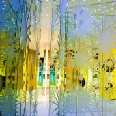
Two distinctive landmarks: Studio and “Big Kaleidoscope” located on two wings end are linked up by radiating arms. Main pathway at South Wing enhances the secret space Zig-zag for children who adore adventure and explore. Big Kaleidoscope made by dimensional mirrors creates reflection for “never ending” illusion.
OPERATION / FLOW / INTERACTION:
Finishing materials take an important decorative role in Stanley House. Regal standards that are harmonized with spatial textures, elegance internal fixtures and fittings are evident to match the luxurious lifestyle. Perceived as the most frequent habituated area, the first class marble become the ideal finishing for the main staircase, attraction also goes to ten-meter high railing run through the entire space. This art piece is wrapped around with lined wood veneer and incorporated with LED lights within every recessing handles.
PROJECT DURATION AND LOCATION:
The Project is finished at January 2012 in Hong Kong.
FITS BEST INTO CATEGORY:
Interior Space and Exhibition Design
|
PRODUCTION / REALIZATION TECHNOLOGY:
-
SPECIFICATIONS / TECHNICAL PROPERTIES:
-
TAGS:
Public service, Education International, Learning Centre, Colour Playgroup, Fun and Education
RESEARCH ABSTRACT:
In order to empower the form & space through the layout and fit various programs, we are applying the Ancient Rome City Planning. Circular elements are common along radiating arms within axis arrangement to chain up the classroom and studios between two distinct wings.
CHALLENGE:
The space design of a 1m-diameter at the centre-point is challenging for the most of designers. To turn obstacles into miracles, it is strategically transformed as a focal point of the learning centre. Like the famous landmark Colosseo, it becomes a performance stage for children acting drama and foundation music instrument. The opposite area acts as an auditorium which is multi-functional and could be transformed between flexible children playground, parent-child interaction platform or parents’ waiting area. Two axes are radiating outward alongside which linking the focal point to others. Circular forms are prioritized on design as it is a familiar shape with them.
ADDED DATE:
2012-09-27 21:20:09
TEAM MEMBERS (6) :
Catherine Cheung – Design Director, Kalother Yim – Interior Designer, Ella Hung – Interior Designer, Tim Yeung – Designer, and
IMAGE CREDITS:
Catherine Cheung, 2012.
|


