DESIGN NAME:
PARADOX HOUSE
PRIMARY FUNCTION:
Design Studio With Gallery
INSPIRATION:
The area of Paradox House was only 80 square-meters on the ground, but the triple height hall with 11 meters has given the feel of a sizeable spacious interior. To maximize the use of space, designer creates several floor slabs for specified zonings by different levels. This brings extra spacious areas to fulfill client’s desire with site limitation. From the ground to top level, amazingly each corner of the studio, it generates different surprising perspective, and need to be discovered.
UNIQUE PROPERTIES / PROJECT DESCRIPTION:
PARADOX HOUSE
GEOMETRY
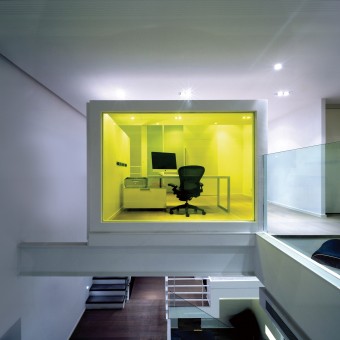
A split-level warehouse turned chic multimedia design studio, Paradox House finds the perfect balance between functionality and style while reflecting its owner unique taste and way of life. It created a striking multimedia design studio with clean, angular lines that showcases a prominent yellow-tinted glass box on the mezzanine. Geometric shapes and lines are modern and awe-inspiring but tastefully done to ensure a unique working space. Located in Bangkok, Paradox House stays true to its name with contrasting design elements, from dark materials paired with stark white walls, to silver aluminum mixed with silky fabrics. The design intends to create a relation between personal life and work which express the client’s life. This studio’s challenge included a flexible use of space and large-group gatherings accommodated.
DECO APPLICATION
ARCHITECTURAL ELEMENT
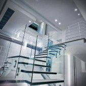
Drawing inspiration from a multitude of contemporary styles, the architecture of Paradox House plays a key decorative role. The steel and glass staircase is definitely the piece de resistance. Cleverly designed to appear as though it suspends freely, creating the illusion of floating planks. You’ll feel like you’re walking on clouds one section of the property to another.
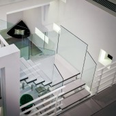
An open floor plan is centered on a three-story space with floating staircase and gallery, endows the spacious interior with a sense of the ethereal. The graphically arresting minimalism of the stair and glass railings which matches architectural and aesthetical characteristic of visible structure, define and focus the flow of the interior’s open volumes.
Composed by voids and solids, the plan and sections are circumscribed by golden rectangles. The architectural feeling becomes the protagonist of the inner spacing and its elements linked together forming a whole. The fusion of the architectural elements and materials, is combined together to emphasize the concept. Staircase is connecting the new built slaps in various forms of pavilions which exhibit itself a sculpture-like feature of inner perspective as a reflection of façade.
ILLUMINATION
Natural light was scarce. The separate sections of Paradox House have been carefully planned and designed to maximize the use of lighting and reflections, which work together to create further contrast and gives this space character.
Aiming to create the feeling of 'natural sunlight' inside the black box, designer uses the 'block' concepts to create lighting effects among boxes of various sizes and heights to generate contrast and manipulate the effects of 'what is lit and what is left' in the shadow, so as to achieve the dynamic impact.
FUNDAMENTAL
Used as a multimedia workshop, it’s only fitting that the top floor of Paradox House was designed to be an inspiring space to think, reflect and most importantly, create. The designer began with the form of a box which sits as a beginning point at the top floor. The feel is young, airy and open but its highly functional design means business; fit for the world-class technology savvy artist. The design concept inherits with all the playful corners; work, relax and fun can be happened at the same time and place.
OPERATION / FLOW / INTERACTION:
An open floor plan is centered on a three-story space with floating staircase and gallery, endows the spacious interior with a sense of the ethereal. The graphically arresting minimalism of the stair and glass railings which matches architectural and aesthetical characteristic of visible structure, define and focus the flow of the interior’s open volumes. Geometric shapes and lines are modern and awe-inspiring but tastefully done to ensure a unique gathering space.
PROJECT DURATION AND LOCATION:
The Project is finished in January 2012 in Bangkok, Thailand.
FITS BEST INTO CATEGORY:
Interior Space and Exhibition Design
|
PRODUCTION / REALIZATION TECHNOLOGY:
-
SPECIFICATIONS / TECHNICAL PROPERTIES:
-
TAGS:
PARADOX, SPLIT LEVEL, GEOMETRY, ARCHITECTURAL ELEMENT, FLOATING, VOID AND SOLID
RESEARCH ABSTRACT:
At 2000, many young designers change their attitude of work and life, give up their full-time employment and operate from home offices. Study area is generally used to operate a home business or gathering friends. The design concept inherits with all the playful corners. Irregular work schedule and overtime work are common; work, relax and fun can be happened at the same time and place. Like this client, she works at Paradox House and deals with clients and work partners there. The client’s projects can be worked individually or team, set up the conference meetings intended to create or generate plans, analysis, discuss or design to support creativity. For functionality, it creates several zones at the top floor including working area, study area and library in addition to deliver ultimate fluidity and movements. The workshop is sited at the top level isolated with those zonings at different levels.
CHALLENGE:
The original function of Paradox House is a warehouse to be converted into a lounge-home office for a multimedia designer. The design intends to create a relation between personal life and work which express the client’s life. This studio’s challenge included a flexible use of space and large-group gatherings accommodated.
ADDED DATE:
2012-09-27 20:20:43
TEAM MEMBERS (8) :
Catherine Cheung – Design Director, Carlina Giovannetti – Architectural Interior Designer, Pollan Wong – Project Designer, Kalother Yim – Interior Designer, Ella Hung – Interior Designer, Tim Yeung – Designer, Kong Cheuk - Designer and
IMAGE CREDITS:
Catherine Cheung, 2012.
|


