DESIGN NAME:
I+da
PRIMARY FUNCTION:
Drug Store
INSPIRATION:
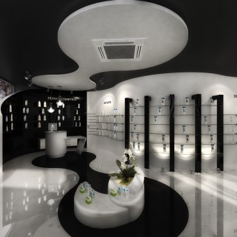
Inspired by the dynamism resulted in the aesthetic with the use of organic forms combined with the use of sober colors that give this elegant touch to i+da
UNIQUE PROPERTIES / PROJECT DESCRIPTION:
i+da is conceived as an elegant and comfortable space designed for the selling of pharmaceutical products, making it an attractive and profitable business. Its composition maintains and emphasizes the organic shapes in furniture and architectural elements; the way the costumer views the place is clean and in equilibrium.
OPERATION / FLOW / INTERACTION:
i + da is intended to customer to feel immersed in pharmaceuticals products to make them feel with freedom and confidence to take any product, the layout is designed for people to follow all local, where users are interacting with various environments making them feel at home.The entrance of natural light is on purpose directed to the inside of the place, by acquiring short showcases, as well as vertical organic acrylic strips; giving as a result amazing shadow and light contrasts.
PROJECT DURATION AND LOCATION:
We present the project as a design concept to the customer in Zaragoza, Spain in February and so far the start of the refurbishment of the premises has not even started
FITS BEST INTO CATEGORY:
Interior Space and Exhibition Design
|
PRODUCTION / REALIZATION TECHNOLOGY:
The furniture fuses and adapts to every unique space in the drug store, customizing the merchandising needs required for the selling of a particular product, drawing the attention of the client making him feel his experiencing a different way of buying.Textures and finishes took an important role in the design; we played with the different heights and dichromatic colors, to create the sense of deeper and wider spaces.
SPECIFICATIONS / TECHNICAL PROPERTIES:
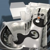
The architectural proposal is based on a real local polygonal shape 8000 mm x 15000 mm x 2900 mm
TAGS:
Organic Shapes, dicromathic colors to achieve duality and contrast,the meaning colours; White proffers the opportunity to view the symbiosis between the outside surroundings while black gives direction to formality and seriousness.
RESEARCH ABSTRACT:
The project is supported by the market research process and field developed over 30 years of experience resulting in a new scheme of pharmacy. Looking for the differentiation of space through a new visual language, creating profitable space and identity.
CHALLENGE:
Challenge: Create a commercial space specializing in the sale of pharmaceutical products with a contemporary design that stands out for its uniqueness and that constitutes a new paradigm both for its aesthetic and functional concept.
Obstacles: Emerging from the real need for a client to renew its business establishment, the major obstacle throughout the design process was the "budget", therefore, seek to maximize each element is "doing more with less."
ADDED DATE:
2012-03-06 20:39:52
TEAM MEMBERS (5) :
Eduardo Galindo Sanchez, Federico Flores Segura, Gustavo Rojo Bahena, Julio Cesar Salgado Cuevas and Osiris Julio Villanueva Vargas
IMAGE CREDITS:
Apotheka Mexico Grupo Apotheka, 2011.
|


