DESIGN NAME:
Alessandro Luciani Designer
PRIMARY FUNCTION:
Shop Concept
INSPIRATION:
THE INSPIRING PRINCIPLES: The inspiring principles of the project consist in transforming the prospective clients’ approach towards their tire-dealers and directly involving them in the choice/purchase process. We tried to add new tools which can provide new experiences. Feeling through feelings. Perceiving through the 5 senses. Visual Merchandising. Communication. Products. Environment. Finding a new way of communication, more effective than the simple gadgets which invade the tyres sector, but leaving, however, its technical characteristics and charm unchanged.
UNIQUE PROPERTIES / PROJECT DESCRIPTION:
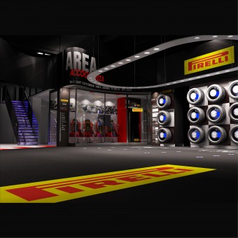
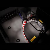
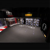
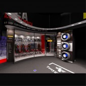
THE PROJECT: It has been based on the development of the “WELCOME” and “VISUAL MERCHANDISING” concepts. Through the creation of a comfortable environment able to stir up emotions and stimulate cultural interest through information. THE RECEPTION- This area is very clearly identifiable, thanks to an effective system of signs and an appropriate lighting. For an immediate identification we have reproduced a stretch of race track, to better “visualize” the long tradition Pirelli has acquired in the motor sports. THE WELCOME AREA- We have conceived a specific air-conditioned reception allowing customers to follow all the operations through the wide glass walls, and make payment and car pick-up easier. This is the reason why, in our opinion, it is necessary that clients are directed to the heart of the Point of Sale. THE INTERIOR OF THE WELCOME AREA- It is characterized by a series of historical photos evoking some of the most important moments of PIRELLI company, well set off by an appropriate lighting positioned along the wall. The sport seats show the PIRELLI logo, following the concept of coordinate image, and make this space more modern. It also includes a Shopping showcase and a Monitor –TV3D, visible from all sides. The Bar-Snack area, clearly identifiable through a special sign, is “discreetly” positioned so as not to invade people present within this WELCOME AREA, conceived as a simple and comfortable space stirring up emotions and combining information, relax, amusement. A NEW WAY OF DISPLAYING TYRES: VISUAL MERCHANDISING ENHANCING THE STIMULUS TO BUY- The wall display, consisting in a series of new displays that enhance the stimulus to buy, is strategically positioned near the welcome area, so that the potential client is emotionally stimulated to buy. This new system will increase the possibility of sales, compared with our “competitors”.
OPERATION / FLOW / INTERACTION:
-
PROJECT DURATION AND LOCATION:
MILANO ITALY - 2011
FITS BEST INTO CATEGORY:
Idea and Conceptual Design
|
PRODUCTION / REALIZATION TECHNOLOGY:
MATERIALS: We have selected materials such as Stainless steel, Plexiglas, Glass, Dibond; quartz and epoxy resins for the floor, and a mixed lighting system consisting in incandescent, energy saving and LED lamps.
SPECIFICATIONS / TECHNICAL PROPERTIES:
-
TAGS:
-
RESEARCH ABSTRACT:
-
CHALLENGE:
OBJECTIVES:
1 – To make the brand more visible within the Point of Sale
2 – To increase sales (either sell-in or sell-out) by creating a new sales section, as imposed by the final customers’ new exigencies identified through the latest market researches.
3 – To develop an innovative, original and modern space and make it comfortable and full of information and characteristics concerning tires.
ADDED DATE:
2012-02-22 12:14:53
TEAM MEMBERS (1) :
Alessandro Luciani Retail Designer
IMAGE CREDITS:
Alessandro Luciani Designer, 2011.
|


