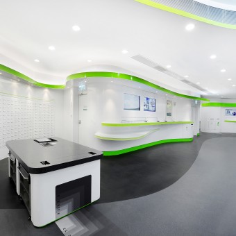
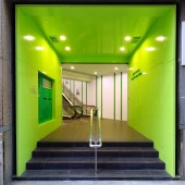
Hongkong Post: Mongkok Post Office by Karr Yip |
Home > Winners > #24502 |
| CLIENT/STUDIO/BRAND DETAILS | |
 |
NAME: The Government of Hong Kong SAR PROFILE: - |
| AWARD DETAILS | |
 |
Hongkong Post: Mongkok Post Office by Karr Yip is Winner in Interior Space and Exhibition Design Category, 2011 - 2012.· Read the interview with designer Karr Yip for design Hongkong Post: Mongkok here.· Press Members: Login or Register to request an exclusive interview with Karr Yip. · Click here to register inorder to view the profile and other works by Karr Yip. |
| SOCIAL |
| + Add to Likes / Favorites | Send to My Email | Comment | Testimonials | View Press-Release | Press Kit |
Did you like Karr Yip's Interior Design?
You will most likely enjoy other award winning interior design as well.
Click here to view more Award Winning Interior Design.


