DESIGN NAME:
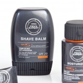
LOREAL MEN'S EXPERT skincare series
PRIMARY FUNCTION:
Mens Skincare Packaging Series
INSPIRATION:
mens watch, sports car, speed
UNIQUE PROPERTIES / PROJECT DESCRIPTION:
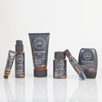
The redesigned caps look like watch dials, inviting men to rewind the clock and refresh their skin. The rubber matte cap is functional and efficient, perfect for the on-the-go professional. The bottom is made from a sleek glossy material, evoking the aforementioned sports car, and the entire product is wrapped in a dark gray primary tone, which better embodies masculinity. I preserve Loreal's brand equity by integrating orange accents on the areas and typography, aligned with the hierarchy of read.
OPERATION / FLOW / INTERACTION:
-
PROJECT DURATION AND LOCATION:
Start from research to development it took us 14 weeks to finalize the redesign project.
FITS BEST INTO CATEGORY:
Packaging Design
|
PRODUCTION / REALIZATION TECHNOLOGY:
-
SPECIFICATIONS / TECHNICAL PROPERTIES:
-
TAGS:
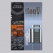
we made strong existence by rebranding, packaging, and made pop display
RESEARCH ABSTRACT:
-
CHALLENGE:
Loreal's mens packaging was feminine, nondescript, unfocused, and ineffective.
In redesigning its packaging, I sought to give it an assertive masculine brand identity, and was inspired by the design, meaning, and form of a sports car and man's watch.
ADDED DATE:
2011-08-24 23:08:29
TEAM MEMBERS (3) :
young joo tak,, lawrence yang, and jung yoon shin
IMAGE CREDITS:
Eunice Young Tak, 2011.
|


