DESIGN NAME:
Wrigley Orbit
PRIMARY FUNCTION:
Chewing Gum Package
INSPIRATION:
Fashion-inspired packaging changes the game for gum
UNIQUE PROPERTIES / PROJECT DESCRIPTION:
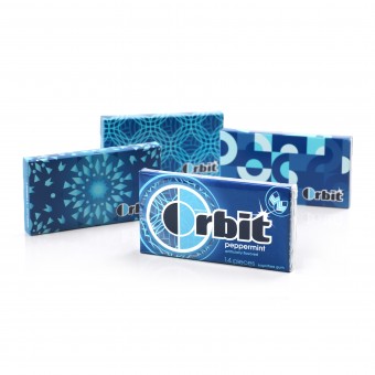
Interbrand’s design innovation has changed the game for the gum category. Rather than a pack of gum, Orbit consumers now carry a stylish accessory in their purse or pocket—an accessory that creates badge and talk value for the brand.
Interbrand brought to life the idea of transformation through a cutting-edge printed overwrap, which leverages Orbit’s iconic “O” as a window to the inner envelope. Peeking through the window is any one of 30 unique patterns designed to bring Orbit’s retro-forward fashion aesthetic to life.
OPERATION / FLOW / INTERACTION:
Interbrand's design creates an experience that’s built around anticipation and an inspiring reveal. When consumers peel away the printed overwrap, which leverages Orbit’s iconic “O” as a window to the inner envelope, they reveal any one of 30 unique patterns designed to bring Orbit’s retro-forward fashion aesthetic to life. Instead of a pack of gum, consumers are now carrying a stylish accessory in their purse or pocket that creates badge value and talk value for the brand.
PROJECT DURATION AND LOCATION:
The Orbit redesign began in Cincinnati and hit shelves in May 2010 throughout the United States, generating buzz in social media, television and the press.
FITS BEST INTO CATEGORY:
Packaging Design
|
PRODUCTION / REALIZATION TECHNOLOGY:
From project start to finish, Interbrand’s Implementation team played an active role. At the very first sketch session, they addressed design feasibility, serving as a resource for overwrap printing capabilities and limitations throughout Orbit’s redesign.
In addition to leveraging the groundbreaking printed overwrap, Interbrand gave Orbit a more premium look by transitioning from a glossy to matte finish with hints of varnish on the envelope.
SPECIFICATIONS / TECHNICAL PROPERTIES:
92 mm x 10 mm x 50 mm
TAGS:
Printed overwrap, patterns, retro-forward, design trends, transformation, inspiring reveal
RESEARCH ABSTRACT:
Interbrand couldn’t just ask young consumers what they wanted; they had to make consumers show what they want. Consumers’ articulated needs comprise only one aspect (5 percent) of decision-making. To produce a truly revolutionary design for Orbit, Interbrand had to tap into the heart of all decision-making: the depths of the unconscious mind, the innate. And Interbrand did just that through Design Insights™, their proprietary qualitative research. Design Insights™ includes both ideal experience collaging, during which consumers use a visual and verbal “toolkit” of literal and metaphorical elements to tell a story of their ideal experience, and brand insights, which enabled an understanding of which equities Orbit owned versus its competitors.
The Interbrand team uncovered key motivating insights for consumers, including: (1) Their belief that if you’re not changing, you’re not trying; and (2) Their desire to be inspired to create their own signature style. As a result, Orbit repositioned itself around the idea of transformation.
Once Interbrand had designed more than 60 patterns and applied them to 12 different flavor colors, they designed and conducted our own research methodology to test the patterns—asking consumers to use the patterns to design customized iPods and relate them to their favorite celebrities in order to understand what was cool and meaningful to their lives. Because Interbrand was changing the paradigm for gum, consumers never knew they were participating in gum research.
CHALLENGE:
-
ADDED DATE:
2011-01-02 10:43:43
TEAM MEMBERS (2) :
Art Director: Michael Palmer and Designer: Marie DeAngelis
IMAGE CREDITS:
Scott Lucas, 2010.
|


