Tels Cargo Branding by Nargiza Usmanova |
Home > Winners > #172023 |
 |
|
||||
| DESIGN DETAILS | |||||
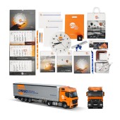
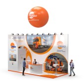
| DESIGN NAME: Tels Cargo PRIMARY FUNCTION: Branding INSPIRATION: The inspiration for the new company logo retains key elements of the TELS brand – its typography, colour palette, and signature five-stripe graphic symbolizing a pallet (a skid) – to ensure continuity and recognition. To reflect dynamism and harmony, we introduced a circular element representing the sun and light. A unique touch is the seamless connection between 'G' and 'O' in Cargo, subtly reinforcing movement, as 'GO' signifies motion and progress. UNIQUE PROPERTIES / PROJECT DESCRIPTION: TELS Cargo is a well-established brand in the European transportation market, clearly focusing on automotive cargo transportation. Our team led the brand identity transformation, starting with the logo redesign, ensuring continuity while reinforcing the company’s new direction. Beyond the logo, we developed a comprehensive brand identity, including truck decals, promotional materials, and an exhibition stand design, creating a cohesive and powerful visual presence. OPERATION / FLOW / INTERACTION: All advertising products were developed to enhance the company’s image and build customer trust, while also fulfilling the company’s daily office and communication needs. PROJECT DURATION AND LOCATION: The project began at the start of 2022 and was completed by the end of 2023 in Toronto. FITS BEST INTO CATEGORY: Graphics, Illustration and Visual Communication Design |
PRODUCTION / REALIZATION TECHNOLOGY: All advertising product layouts are created using graphic design software. SPECIFICATIONS / TECHNICAL PROPERTIES: The following products were created: logos and identities, truck designs, wall calendars, office supplies, greeting cards with envelopes, water bottles, stand designs, bags, wall clocks, as well as gifts and souvenirs. TAGS: Branding, Identity, Graphic design, Logo design, Visual design RESEARCH ABSTRACT: A dynamic, modern visual style was crafted for TELS Cargo, reflecting professionalism and forward thinking. Conceptual imagery with a tech-inspired touch emphasized innovation and movement in transportation. A gray and bold orange palette reinforced the brand's identity, with orange symbolizing sun, light, and optimism. The design balanced energy, confidence, and a sleek, stylish aesthetic. CHALLENGE: The hardest part of this design activity was integrating the TELS Group's historical brand legacy with TELS Cargo's new strategic direction. This process faced creative challenges such as balancing tradition with innovation. Internally, the historical significance and social identity of the brand were pivotal, while externally, legal constraints, production capabilities, tech advancements, and access to information posed additional hurdles. ADDED DATE: 2025-03-17 14:50:49 TEAM MEMBERS (1) : IMAGE CREDITS: Image #N1 : Photographer Maxim Zinchuk Image #N2 : Photographer Maxim Zinchuk Image #N3 : Photographer Maxim Zinchuk Image #N4 : Photographer Maxim Zinchuk Image #N5 : Photographer Maxim Zinchuk PATENTS/COPYRIGHTS: Copyrights belong to Nargiza Usmanova, 2024 and NUMZ Graphics. |
||||
| Visit the following page to learn more: https://numzgraphics.com/ | |||||
| AWARD DETAILS | |
 |
Tels Cargo Branding by Nargiza Usmanova is Winner in Advertising, Marketing and Communication Design Category, 2024 - 2025.· Read the interview with designer Nargiza Usmanova for design Tels Cargo here.· Press Members: Login or Register to request an exclusive interview with Nargiza Usmanova. · Click here to register inorder to view the profile and other works by Nargiza Usmanova. |
| SOCIAL |
| + Add to Likes / Favorites | Send to My Email | Comment | Testimonials | View Press-Release | Press Kit |
Did you like Nargiza Usmanova's Advertising Design?
You will most likely enjoy other award winning advertising design as well.
Click here to view more Award Winning Advertising Design.


