Syha Sanitary Pad Packaging by Angela Spindler |
Home > Winners > #169923 |
 |
|
||||
| DESIGN DETAILS | |||||
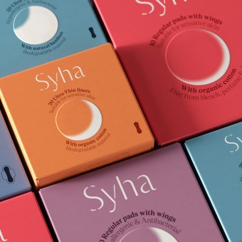
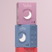
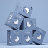
| DESIGN NAME: Syha PRIMARY FUNCTION: Sanitary Pad Packaging INSPIRATION: In developing Syha’s refreshed branding, Depot drew upon the timeless symbolism of the moon—a symbol that has long been associated with the cycles of women’s lives. The moon represents empowerment, reflection, and renewal, which makes it the perfect central motif for Syha’s identity. The moon’s subtle phases are integrated throughout the packaging, mirroring the natural rhythms of life and honouring cycles of change and renewal. UNIQUE PROPERTIES / PROJECT DESCRIPTION: Celebrating Nature, Sustainability, and Self-Care. We were invited to refresh the identity and packaging for Syha, a menstrual wellness brand committed to easing the discomfort of periods with plant-based products. The original packaging did not effectively resonate with women; it was overly industrial and lacked the empathy needed to speak to the needs and experiences of the modern consumer. OPERATION / FLOW / INTERACTION: - PROJECT DURATION AND LOCATION: The project started in December 2023, was finalised and launched in September 2024, Australia FITS BEST INTO CATEGORY: Packaging Design |
PRODUCTION / REALIZATION TECHNOLOGY: Inspired by the richness of Western Australia’s terrain, we chose a colour palette that reflects both the serenity of nature and its fiery strength. This blend not only enhances the visual identity but also aligns with the product's purpose and function, offering a balance that feels soothing and energizing—just like the brand itself. To further elevate the packaging we integrated subtle finishes such as blind embossing and a flat matte finish. The blind embossing technique subtly draws attention to key elements of the design without overwhelming the visual narrative, offering a tactile yet refined experience that reflects the brand’s authenticity and care. SPECIFICATIONS / TECHNICAL PROPERTIES: The packaging is printed on an uncoated box board using spot colours, blind embossed and finished with an all-over aqueous varnish. TAGS: Packaging Design, Sanitary Pad Packaging Design, Branding & Packaging Design, Wellness Packaging, Beauty Packaging, Branding & Packaging Design, Hygiene Product Packaging Designs, Creative Sanitary Pad Packaging Designs RESEARCH ABSTRACT: The overall identity celebrates the harmony between nature, sustainability, and self-care, empowering Syha’s customers to move through life’s rhythms with confidence and ease. Every design element, from the colour palette to the tactile details, reflects Syha’s deep commitment to wellness, sustainability, and the natural cycles of life. The refreshed branding and packaging serve as a reminder to embrace the journey of life, honouring both the personal and universal rhythms that define us. Depot's collaboration with Syha embodies our belief that branding is not just about visual design—it’s about creating a powerful, meaningful connection with the consumer. Through thoughtful design and a deep understanding of Syha’s mission, we’ve helped them connect with women on a more personal, empathetic level. CHALLENGE: There were no particular challenges, other than having it printed offshore. ADDED DATE: 2025-02-25 23:48:58 TEAM MEMBERS (2) : Creative Director: Angela Spindler and IMAGE CREDITS: Angela Spindler, 2024. |
||||
| Visit the following page to learn more: https://www.wearedepot.com.au/work/syha- |
|||||
| AWARD DETAILS | |
 |
Syha Sanitary Pad Packaging by Angela Spindler is Winner in Packaging Design Category, 2024 - 2025.· Read the interview with designer Angela Spindler for design Syha here.· Press Members: Login or Register to request an exclusive interview with Angela Spindler. · Click here to register inorder to view the profile and other works by Angela Spindler. |
| SOCIAL |
| + Add to Likes / Favorites | Send to My Email | Comment | Testimonials | View Press-Release | Press Kit |
Did you like Angela Spindler's Packaging Design?
You will most likely enjoy other award winning packaging design as well.
Click here to view more Award Winning Packaging Design.


