Romance Syrup by Mohammadreza Eslamparast |
Home > Winners > #169819 |
 |
|
||||
| DESIGN DETAILS | |||||
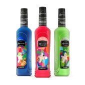
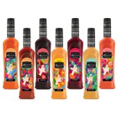
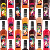
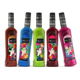
| DESIGN NAME: Romance PRIMARY FUNCTION: Syrup INSPIRATION: The design of the bottle and the labels is inspired by the name of the brand Romance, because of meaning of the name the bottle has feminine curves and labels are designed with women in each taste. Because this product is from India, it is used an Indian modern woman face to show a Romatic situation. UNIQUE PROPERTIES / PROJECT DESCRIPTION: These products are used in parties and cafes, so it is used colorful forms to feel happiness and liveliness. To make them different they are designed with modern illustration technique. The style is cubist and 2D vector illustration. Because most designs of this kind of products use real fruits it is decided to make them illustration. OPERATION / FLOW / INTERACTION: The bottle shape is narrow and tall to make it easy to use and to catch it with one hand. The ROPP cap make it suitable to pour slowly the liquid. PROJECT DURATION AND LOCATION: The project started in July 2024 in Tehran finished in September 2024 in Tehran FITS BEST INTO CATEGORY: Packaging Design |
PRODUCTION / REALIZATION TECHNOLOGY: The labels are printed on matte adhesive back labels with narrow web Flexo machine. The material is paper. Each one is printed in 6 to 8 colors. The bottle is made from glass with a ROPP cap. SPECIFICATIONS / TECHNICAL PROPERTIES: Bottle: Width 68 mm x Depth 68 mm X Height 305 mm Label: Width 50 mm x Height 140 mm TAGS: Syrup, Drink, Romance, Lovely, Colorful, Cafe, Party, Illustrations, Modern, Label, RESEARCH ABSTRACT: It took a two-week exploratory research. Analyzing trends syrup design in the world, They identified a market gap for innovative designs, particularly in Cubism with flat colors. This discovery inspired a visually striking and functional packaging style, enhancing brand differentiation. There were 3 methods: shrink, full wrap label and half label before designing the bottle and decided to use half labelling. CHALLENGE: The most challenging aspect of this design activity was managing the complexity of 30 distinct flavors while ensuring they formed a cohesive visual identity. The challenge was to create diverse color spaces that were visually harmonious. labels are small and narrow so it made the design harder and had to use the less words and use objects to show their tastes. ADDED DATE: 2025-02-25 12:07:15 TEAM MEMBERS (1) : IMAGE CREDITS: Illustrator: Mohammadreza Eslamparast Industrial Designer: Kourosh Khanmohamadi Assistant: Soodabeh Zomorodi, Samyar Eslamparast PATENTS/COPYRIGHTS: Copyrights belongs to Romance syrups owner |
||||
| Visit the following page to learn more: https://www.instagram.com/mohammadreza_e |
|||||
| AWARD DETAILS | |
 |
Romance Syrup by Mohammadreza Eslamparast is Winner in Packaging Design Category, 2024 - 2025.· Read the interview with designer Mohammadreza Eslamparast for design Romance here.· Press Members: Login or Register to request an exclusive interview with Mohammadreza Eslamparast. · Click here to register inorder to view the profile and other works by Mohammadreza Eslamparast. |
| SOCIAL |
| + Add to Likes / Favorites | Send to My Email | Comment | Testimonials | View Press-Release | Press Kit |
Did you like Mohammadreza Eslamparast's Packaging Design?
You will most likely enjoy other award winning packaging design as well.
Click here to view more Award Winning Packaging Design.


