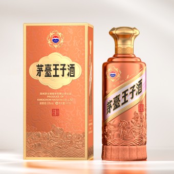
DESIGN NAME: Moutai Prince
PRIMARY FUNCTION: Packaging
INSPIRATION: A Chinese saying describes a sesame stalk blooming notch by notch, rising ever higher, as a symbol of career and life progress. Inspired by this, the bottle base emulates the natural beauty of a sesame pod with its sleek, naturally curved form. The top mimics a blooming sesame flower, symbolizing prosperity and flourishing. The T shaped cap combines sesame petal motifs with an illustration of five cranes, evoking a solid, refined feel while adding both cultural and artistic values.
UNIQUE PROPERTIES / PROJECT DESCRIPTION: Moutai Prince Classic Moutai Flavor, launched by Kweichow Moutai Co.,Ltd., has earned widespread acclaim for its exceptional quality. To further strengthen the distinct identity and core competitive edge of the brand, its packaging has undergone a comprehensive revamp, encompassing color coordination, pattern design, and craftsmanship. This redesign not only enhances its visual appeal but also effectively communicates the cultural significance of the brand.
OPERATION / FLOW / INTERACTION: By integrating rich traditional cultural elements, each sip of the premium liquor allows users to deeply experience the essence of profound Chinese heritage, fostering their cultural confidence and identity. The meaningful symbols and blessings on the packaging transcend mere decorations, serving as a bridge that connects the brand with consumers and evokes emotional resonance.
PROJECT DURATION AND LOCATION: The design and development of this packaging started in Chengdu, Sichuan Province, in March 2024. It was then introduced to the Chinese market in December 2024.
FITS BEST INTO CATEGORY: Packaging Design
|
PRODUCTION / REALIZATION TECHNOLOGY: The bottle base is finished with a delicate velvet texture that conveys a luxurious and distinctive quality while enhancing comfort when held. The cap is meticulously crafted using metal embossing techniques, resulting in a detailed and richly layered texture that creates a vivid 3D visual effect. These fine details enhance the visual appeal and artistic charm of the product.
SPECIFICATIONS / TECHNICAL PROPERTIES: A bottle contains 500ml
TAGS: Packaging design, Delicate velvet texture, Metal embossing techniques, Symbolism of sesame blossoms, Integration of traditional cultural elements
RESEARCH ABSTRACT: This design goes beyond celebrating traditional aesthetics, further conveying the culture and values of the brand. With richly layered design elements, the packaging invites a profound dialogue with consumers, offering a superior sensory experience and a deep sense of cultural identity. It also amplifies the emotional value and sparks social interactions, fostering greater user satisfaction and loyalty. Every encounter with the product provides a joyful user experience full of heartfelt wishes.
CHALLENGE: The core challenge was to enhance visual impact while ensuring a cohesive style through color coordination. To this end, the color scheme is dominated by an elegant sauce hue, complemented by bronze and gilded gold tones that add depth and richness to the visual layers. A diagonal label, set against a wisteria purple backdrop and framed by golden wheat ear patterns, adds a touch of refinement. Thoughtful color distribution and transition create visual harmony, resulting in a unified aesthetic.
ADDED DATE: 2025-02-21 01:54:00
TEAM MEMBERS (1) : General Manager and Design Director: Jingan Jia
IMAGE CREDITS: Chengdu Wanjiazu Technology Co., Ltd, 2024.
|