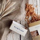
POTAMYA Packaging Design by Ebru Sile Goksel and Ipek Eris Ugurlu |
Home > Winners > #168467 |
 |
|
||||
| DESIGN DETAILS | |||||
| DESIGN NAME: POTAMYA PRIMARY FUNCTION: Packaging Design INSPIRATION: Potamya’s design is deeply rooted in ancient Mesopotamian culture, the birthplace of agriculture. The visual language reflects the artifacts, tools, and symbols from this era, reimagined through a modern, minimalistic approach. The logo, set in a deep navy, draws inspiration from geometric forms found in ancient Mesopotamian tools and inscriptions, creating a timeless yet contemporary feel. The illustration concept is a direct nod to the origins of agriculture, featuring stylized representation. UNIQUE PROPERTIES / PROJECT DESCRIPTION: Rooted in ancient Mesopotamian culture—the birthplace of agriculture—Potamy OPERATION / FLOW / INTERACTION: We designed the packaging to challenge traditional pasta-buying habits by making the benefits of legume pasta instantly clear. A transparent window showcases the organic pasta, while bold labeling highlights its rich nutrition, building awareness and trust. The back of the box features a warm illustration of the cooking process and key product details, reinforcing its uniqueness. As an emerging category, legume pasta needed an equally innovative approach, leading to a sustainable, thoughtfully designed package aligned with the brand’s philosophy. To change the perception that legume pasta may lack flavor, we included a collection of delicious, inspiring recipes. Potamya quickly gained attention, appealing to health-conscious and eco-friendly consumers. PROJECT DURATION AND LOCATION: The creation of the brand identity, including the logo, typography, color palette, graphic style, and illustrations, and their integration into the packaging design, took 1.5 months. An additional 1.5 months was dedicated to preparing the packaging for printing and producing samples, bringing the total project timeline to 3 months. |
PRODUCTION / REALIZATION TECHNOLOGY: The packaging is crafted using eco-friendly, recyclable materials, ensuring minimal environmental impact. The peel-off measuring system was developed after extensive prototyping, collaborating with multiple manufacturers to perfect its seamless usability. The structure is designed for efficiency in production while maintaining durability, ensuring that the innovative measuring feature remains functional throughout the product's lifespan. SPECIFICATIONS / TECHNICAL PROPERTIES: The Potamya legume pasta packaging series is produced in various sizes and weights depending on the pasta type. The colors are chosen to match the hue of the legumes, aligning with the pasta visible through the window area. The measuring cup is designed based on a single portion (80g). TAGS: Sustainability, packaging, illustration, design, food, potamya, pasta, food, sustainable design, graphic design RESEARCH ABSTRACT: To restore the disrupted natural balance, one of the most critical factors in ensuring sustainability is clean farming—yet it is practiced on only 1% of the world's agricultural lands. Organic farming leads to an increase in both the quantity and quality of produce. Globally, one out of every three plates of food goes to waste, three children die of hunger every minute, and 60% of food waste could be recovered. To consume nature’s gifts without waste, we have developed a portioned cap system. Contribute to sustainable living by consuming responsibly. CHALLENGE: The challenge was shifting consumer habits from traditional pasta to nutrient-rich legume pasta while encouraging sustainable practices. The design not only emphasizes the health benefits of legume-based alternatives but also incorporates a built-in portion control system for effortless, precise serving. By seamlessly integrating this feature into the packaging, the project promotes sustainability and enhances convenience in everyday cooking. Overcoming manufacturing limitations and aligning sustainability with innovation pushed the boundaries of conventional packaging design. ADDED DATE: 2025-02-14 01:41:55 TEAM MEMBERS (2) : Creative Directors & Designers: Ebru Sile Goksel, Ipek Eris Ugurlu and Graphic Designer: Cansu Taskin IMAGE CREDITS: Creative Directors & Designers: Ebru Sile Goksel, Ipek Eris Ugurlu Graphic Designer & Illustator: Cansu Taskin |
||||
| Visit the following page to learn more: https://www.studioborn.co | |||||
| AWARD DETAILS | |
 |
Potamya Packaging Design by Ebru Sile Goksel and Ipek Eris Ugurlu is Winner in Sustainable Products, Projects and Green Design Category, 2024 - 2025.· Read the interview with designer Ebru Sile Goksel and Ipek Eris Ugurlu for design POTAMYA here.· Press Members: Login or Register to request an exclusive interview with Ebru Sile Goksel and Ipek Eris Ugurlu. · Click here to register inorder to view the profile and other works by Ebru Sile Goksel and Ipek Eris Ugurlu. |
| SOCIAL |
| + Add to Likes / Favorites | Send to My Email | Comment | Testimonials | View Press-Release | Press Kit |
Did you like Ebru Sile Goksel and Ipek Eris Ugurlu's Sustainable Product Design?
You will most likely enjoy other award winning sustainable product design as well.
Click here to view more Award Winning Sustainable Product Design.


