DESIGN NAME:
Finenutri
PRIMARY FUNCTION:
Wellness Packaging
INSPIRATION:
Finenutri is a scientific anti-aging nutritional supplement brand developed specifically for women over 25 years old. It is committed to breaking the impression that traditional healthcare product packaging looks like medicine.
UNIQUE PROPERTIES / PROJECT DESCRIPTION:
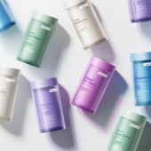
Distinctive colors are designed for different products, some are fresh and elegant, and some are vibrant and bright, just like the diverse charm of young women, making the brand image younger and more fashionable, more in line with the aesthetic taste of young women and standing out among many products.
OPERATION / FLOW / INTERACTION:
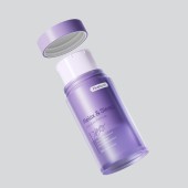
The frosted outer bottle design allows for easy visibility of the capsule count, reducing the frequency of opening by consumers.This feature effectivelyprevent the problem of capsules getting wet that can arise from multiple openings.
PROJECT DURATION AND LOCATION:
The project started in January 2024 in Guangzhou and finished in September.
FITS BEST INTO CATEGORY:
Packaging Design
|
PRODUCTION / REALIZATION TECHNOLOGY:
Developed a minimalist bottle design with smooth, organic lines using PETG eco-friendly material. The dual-layer structure combines a frosted outer shell with a food-grade inner container. The outer shell features a finely textured matte finish through advanced sandblasting, achieving sophisticated elegance while creating subtle visual depth with mysterious translucency. This construction enables light-blocking storage that preserves active ingredients. The clean typography and focused iconography highlight product efficacy, balancing scientific precision with a consumer-friendly information hierarchy for quick comprehension.
SPECIFICATIONS / TECHNICAL PROPERTIES:
105x55x55mm It is an comfort size for woman to hold easily in one hand.
TAGS:
supplement, fashionable, sandblasting, nested structures
RESEARCH ABSTRACT:
For every function product, select 2-3 color schemes that best evoke associations and compare them with existing market packaging colors. Conduct a vote to determine the chosen color scheme, make tonal adjustments, and then select the highest-rated packaging after producing over three prototype rounds.
CHALLENGE:
When developing multiple series of products, we need to maintain visual color consistency and harmony between the outer bottle, liner, and lid. We spent a lot of time and effort to carefully check the color and light/dark ratio. Each product requires that the packaging color reminds us of its efficacy, so we did a lot of research internally.
ADDED DATE:
2025-02-13 03:10:08
TEAM MEMBERS (1) :
Fengnan Lin
IMAGE CREDITS:
Fengnan Lin, 2024.
|


