Snack Packaging by Kazuo Fukushima and Haruka Takeuchi |
Home > Winners > #168316 |
 |
|
||||
| DESIGN DETAILS | |||||
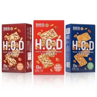
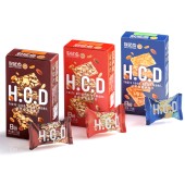
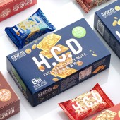
| DESIGN NAME: Snack PRIMARY FUNCTION: Packaging INSPIRATION: The project was inspired by the goal of rejuvenating Haochidian, a beloved snack brand with over a decade of history. The design aims to connect tradition with modernity, appealing to a younger, style conscious audience while preserving the brand’s heritage. The smile icon symbolizes joy, while vibrant colors and floating elements bring energy and freshness to the brand image. UNIQUE PROPERTIES / PROJECT DESCRIPTION: The Snack packaging rebranding project presents a fresh identity for Haochidian, a well known Chinese snack brand. The initials Hcd offer a modern and international touch, while a smile icon next to the logo represents happiness and friendliness. Floating visuals of biscuits and ingredients highlight the crispy texture and quality. Bold typography, embossed details, and color coded flavors enhance visibility and create a dynamic shelf presence. OPERATION / FLOW / INTERACTION: First, analyze the market and understand the current situation Next, perform target analysis to verify what kind of design consumers want. Third, brand analysis, analyze how it has advantages over competing products. Fourth, develop creative ideas. Fifth, Start the design. Make it an original design. Sixth, sample check, color check, etc. Finally, check the finished product. PROJECT DURATION AND LOCATION: The project started in May 2022 and finished in January 2023 in Shanghai. FITS BEST INTO CATEGORY: Packaging Design |
PRODUCTION / REALIZATION TECHNOLOGY: The packaging uses offset printing with spot UV and embossing techniques to highlight the logo and key visuals. These tactile elements enhance the premium feel of the design. High quality cardboard was selected for its durability and ability to maintain product freshness. A color coded design system distinguishes each flavor, improving recognition for consumers. SPECIFICATIONS / TECHNICAL PROPERTIES: Paper box : Width 270mm x Depth 185mm x Height 65mm PVC : Width 90mm x Depth 60mm TAGS: Haochidian, Snack Packaging, Rebranding, Crispy Biscuit, Modern Design, Bold Typography, Flavor Differentiation, Premium Snack RESEARCH ABSTRACT: Analysis of luxury supermarkets where products are sold. Competitive analysis in internet sales. Analysis of targets in the market. Package analysis of the Japanese market. CHALLENGE: The main challenge was to create a contemporary brand identity for Haochidian without losing its established character. Research on consumer behavior emphasized the importance of bold, engaging visuals and tactile design elements. Balancing the brand’s heritage with modern aesthetics required thoughtful design decisions to ensure functionality and consistency across various packaging formats. ADDED DATE: 2025-02-12 03:47:23 TEAM MEMBERS (6) : Team Member: , Creative Director: Kazuo Fukushima, Designer: Haruka Takeuchi , Project Management: Zhang YiTing, Creative Agency : FUDESIGN and IMAGE CREDITS: Photographer: Zhu Jie PATENTS/COPYRIGHTS: Copyrights belong to Dali Foods |
||||
| Visit the following page to learn more: https://www.daligroup.com/Pr_index_gci_1 |
|||||
| AWARD DETAILS | |
 |
Snack Packaging by Kazuo Fukushima and Haruka Takeuchi is Winner in Packaging Design Category, 2024 - 2025.· Read the interview with designer Kazuo Fukushima and Haruka Takeuchi for design Snack here.· Press Members: Login or Register to request an exclusive interview with Kazuo Fukushima and Haruka Takeuchi. · Click here to register inorder to view the profile and other works by Kazuo Fukushima and Haruka Takeuchi. |
| SOCIAL |
| + Add to Likes / Favorites | Send to My Email | Comment | Testimonials | View Press-Release | Press Kit |
Did you like Kazuo Fukushima and Haruka Takeuchi's Packaging Design?
You will most likely enjoy other award winning packaging design as well.
Click here to view more Award Winning Packaging Design.


