The Goodness Co. Packaging Design by Ebru Sile Goksel and Ipek Eris Ugurlu |
Home > Winners > #168307 |
 |
|
||||
| DESIGN DETAILS | |||||
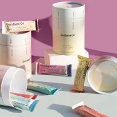
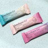
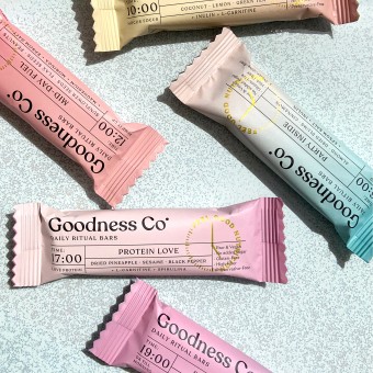
| DESIGN NAME: The Goodness Co. PRIMARY FUNCTION: Packaging Design INSPIRATION: Goodness Bars are designed to help you build a healthy habit aligned with your body's circadian cycle, supporting you with "goodness" UNIQUE PROPERTIES / PROJECT DESCRIPTION: Goodness Co. was founded by 3 women united by a vision to elevate well-being and infuse everyday life with "goodness." OPERATION / FLOW / INTERACTION: The contents of the bars, formulated by a circadian nutrition expert, were carefully tailored to support the body's needs and emotional states at different times of the day. Through consultations, 7 specific bars were selected to provide functional benefits, with their ingredients communicated in a clear and simple way. Choosing the color palette was a pivotal aspect of the project. Our goal was to create a tapestry of colors that not only mirrors the daily routine but also embodies the essence of wellness, forming a harmonious and visually engaging spectrum. We conducted in-depth research on the sky’s color transitions from early morning to sunset, meticulously curating a complementary gradient that naturally flows with the rhythm of the day. Each package was designed to align with the other, ensuring a cohesive and immersive experience. To enhance both aesthetics and usability, we developed a cylindrical box that highlights the visual harmony of the bars while reinforcing the concept of a daily cycle. The packaging underwent demo testing, featuring compartments that keep the bars in sequence, maintaining the integrity of the ritual. PROJECT DURATION AND LOCATION: The creative process began with the brand naming and defining the tone of voice. We set the name Goodness Co., and developed the brand manifesto, tone of voice, and taglines within 3 weeks. The packaging concept process began in March 2020, taking about 1 to 1.5 months, with finalizing the print files and receiving sample prints taking an additional 1.5 months. This phase was completed by the end of May 2020, totaling 3,5 months. It was launched in Istanbul and globally recognized. FITS BEST INTO CATEGORY: Packaging Design |
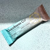
PRODUCTION / REALIZATION TECHNOLOGY: Each bar is crafted with 2 carefully chosen hues, balancing both individual harmony and connection with each other, creating a visually striking and cohesive experience when placed together. Each bar states a different phase of the day with its unique color and naming. A delicate touch of gold foil accents the clock graphic on each bar, subtly signaling the ideal time for consumption and reinforcing the habit of healthy nourishment. The 7 individual bars are packed in a cylindrical box with compartments designed as a cycle. At the top, a clock graphic with the phrase "Feel Good Nutrition" encourages the daily ritual. SPECIFICATIONS / TECHNICAL PROPERTIES: Each bar measures 4.5 inches in length, 1.5 inches in width, and 1 inch in height. To support a healthy daily ritual, they also come in a cylindrical box holding 7 bars, representing a full-day cycle in a compact, portable, and visually cohesive design. TAGS: Packaging, minimal, color, typography, design RESEARCH ABSTRACT: The project explored how design can influence perception and behavior toward health-conscious choices. Research focused on overcoming skepticism toward functional snacks by integrating engaging branding elements, such as a time-guided structure, a cohesive color system, and clear, inviting typography. The study included consumer feedback on packaging appeal, usability, and the psychological effects of associating colors with specific times of day. Insights revealed that an aesthetically driven, structured eating approach encourages consistency in daily nutrition while enhancing the overall consumer experience. The structured time-based naming system (e.g., Good Morning Darling at 08:00, Time to Focus at 10:00, 12.00 Mid-Day Fuel, 14.00 Sweet Break...) encourages consumers to see the bars as part of a holistic wellness journey and feeling good is a choice. CHALLENGE: Our challenge was to make healthy habits fun while maintaining trust and functionality. The goal was to transform a functional, nutrient-dense product into something visually appealing and emotionally engaging. Superfoods like Epsom salt, Spirulina, L-Carnitine, Inulin, and Moringa—ingredient ADDED DATE: 2025-02-12 02:16:03 TEAM MEMBERS (4) : Creative Directors & Designers: Ebru Sile Goksel, Ipek Eris Ugurlu, Graphic Designer: Alara Murkozoglu, Brand Naming: Studio Born and Copywriting: Ipek Senol IMAGE CREDITS: Photos: Studio Born & FoieGras New Media |
||||
| Visit the following page to learn more: https://www.studioborn.co | |||||
| AWARD DETAILS | |
 |
The Goodness Co. Packaging Design by Ebru Sile Goksel and Ipek Eris Ugurlu is Winner in Packaging Design Category, 2024 - 2025.· Read the interview with designer Ebru Sile Goksel and Ipek Eris Ugurlu for design The Goodness Co. here.· Press Members: Login or Register to request an exclusive interview with Ebru Sile Goksel and Ipek Eris Ugurlu. · Click here to register inorder to view the profile and other works by Ebru Sile Goksel and Ipek Eris Ugurlu. |
| SOCIAL |
| + Add to Likes / Favorites | Send to My Email | Comment | Testimonials | View Press-Release | Press Kit |
Did you like Ebru Sile Goksel and Ipek Eris Ugurlu's Packaging Design?
You will most likely enjoy other award winning packaging design as well.
Click here to view more Award Winning Packaging Design.


