DESIGN NAME:
Kanade Japanese
PRIMARY FUNCTION:
Packaging
INSPIRATION:
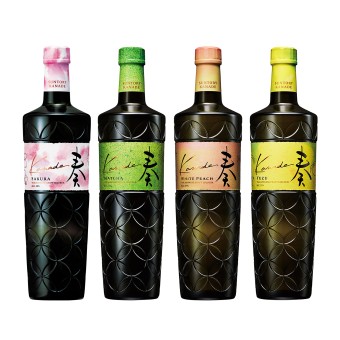
The inspiration came directly from experiencing the liqueur itself. Its delicate, natural taste evoked imagery of soft, flowing watercolors—an artistic representation of Japanese subtlety and harmony. This led to a design that visually reflects the product’s smooth, sophisticated flavor using handcrafted textures and organic elements.
UNIQUE PROPERTIES / PROJECT DESCRIPTION:
Kanade embodies Japan's traditional craftsmanship in liqueur-making. Drawing inspiration from Suntory’s renowned whiskey line, it incorporates a Kanji character to align with the House of Suntory aesthetics. Designed for both local and global audiences, Kanade offers a distinctly Japanese appeal with worldwide resonance.
OPERATION / FLOW / INTERACTION:
Consumed neat, on the rocks, or in cocktails.
PROJECT DURATION AND LOCATION:
1 year, Tokyo
FITS BEST INTO CATEGORY:
Packaging Design
|
PRODUCTION / REALIZATION TECHNOLOGY:
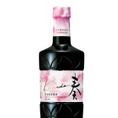
The packaging employs custom washi paper featuring subtle glossy fibers to balance matte softness with refined shine. It includes a handwritten calligraphy logo, a custom typeface, and watercolor paintings representing each flavor. This meticulous approach highlights the artisanal quality and premium positioning of the liqueur.
SPECIFICATIONS / TECHNICAL PROPERTIES:
700ml
TAGS:
#packagedesign, #packaging, #branding, #Japanese, #Japan, #liqueur, #alcohol, #drink, #craft, #handcrafted, #natural, #brandidentity
RESEARCH ABSTRACT:
We conducted field testing in a bar and spoke with bartenders to understand how the bottle’s design impacts usability and perception. Insights from their feedback led to design adjustments for ease of pouring and tactile elements, ensuring a balance between aesthetic appeal and functionality for both bartenders and consumers.
CHALLENGE:
Achieving a balance between a distinctly Japanese design and global appeal was challenging. The development of original washi paper that maintained its natural texture during printing required minimal digital intervention. The paper's fine glossy fibers blend a matte texture with subtle shine, enhancing the tactile experience and emphasizing the handcrafted quality.
ADDED DATE:
2025-02-03 08:04:43
TEAM MEMBERS (1) :
IMAGE CREDITS:
Yuko Takagi
PATENTS/COPYRIGHTS:
Yuko Takagi
|


