DESIGN NAME:
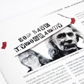
Rebel Type
PRIMARY FUNCTION:
Magazine
INSPIRATION:
Rebel Type draws from the bold energy of movements like punk, where typography became a tool of protest and expression. Inspired by the stages of design, evolution breaking rules, chaos, and reinvention, it reflects the rebellious spirit of typography as a medium of visual and cultural change. This project aims to celebrate and redefine the role of type in challenging conventions and fostering creativity.
UNIQUE PROPERTIES / PROJECT DESCRIPTION:
Rebel Type is a monthly magazine exploring the rebellious and transformative power of typography. It challenges traditional norms with bold layouts, unconventional typographic choices, and a raw aesthetic inspired by the punk movement. With interviews, cultural insights, and a focus on the DIY ethos, the magazine connects typography to broader social and artistic revolutions. Each issue offers a fresh and innovative take on visual storytelling for creatives seeking disruption and inspiration.
OPERATION / FLOW / INTERACTION:
"Rebel Type" is designed to engage readers with its tactile and visual elements. As they flip through the pages, they experience bold layouts, unexpected typographic choices, and interactive features like pop-ups and fold-outs. The magazine encourages discovery, offering readers both a physical and mental experience. Its raw, rebellious aesthetic challenges conventional design, inviting creatives to rethink typography and visual storytelling in a fresh and inspiring way.
PROJECT DURATION AND LOCATION:
The project was developed between August and October 2024 in Lima, Peru
|
PRODUCTION / REALIZATION TECHNOLOGY:
The magazine was printed on special paper with texture, raw finish, featuring subtle specks resembling recycled paper. This choice added a tactile, organic feel to the design, enhancing its experimental aesthetic. For the cover, a metallic material was used to reflect the theme of electronic music, emphasizing the energy, movement, and dynamism of this special edition.
SPECIFICATIONS / TECHNICAL PROPERTIES:
Size: 20.5 cm x 27.5 cm with a thickness of approximately 5 mm, including various pop-ups and fold-out elements.
Interior Paper: 200 gsm with a textured, recycled-like finish for a tactile and organic feel.
Cover Paper: 300 gsm with a metallic finish, emphasizing the dynamism and energy of electronic music featured in the special edition
TAGS:
Typography magazine, punk design, rebellious typography, experimental layouts, graffiti art, DIY aesthetic, modern design, subculture typography, visual storytelling, Music.
RESEARCH ABSTRACT:
The research explored the intersection of typography, art, and activism. Objectives included investigating how typography has historically been used in protests and subcultures, such as punk zines and graffiti, and translating that rebellious energy into a modern magazine format. Methods included studying archival materials, interviewing creatives, and experimenting with visual styles. The outcome is a magazine that challenges norms while showcasing typography as an artistic and cultural force.
CHALLENGE:
One of the biggest challenges was integrating the rebellious and chaotic essence of punk into a clean and organized design. The main struggle was balancing experimental elements with readability, especially when working with white space. After much iteration, I achieved a fusion of bold, rebellious aesthetics with a polished and functional visual structure.
ADDED DATE:
2025-01-20 17:44:40
TEAM MEMBERS (1) :
IMAGE CREDITS:
Jared Iannacone, 2024.
|


