K Soft Website Generating Leads by Pinar Bahar |
Home > Winners > #165105 |
 |
|
||||
| DESIGN DETAILS | |||||
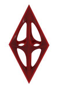
| DESIGN NAME: K Soft Website PRIMARY FUNCTION: Generating Leads INSPIRATION: The K letter mark, inspired by the inner workings of a cable, symbolizes the fusion of physics and software technology. It draws from the futuristic spirit of 1980s tech, reinforcing K Soft's expertise in delivering cutting-edge solutions. During our discovery call, the client highlighted Microsoft and Tesla as favorite brands. This identity merges the innovation of 1980s Microsoft with SpaceX's boldness, capturing a forward-thinking and adventurous vision for the future. UNIQUE PROPERTIES / PROJECT DESCRIPTION: K Soft, a forward-thinking technology company specializing in software development, AI powered solutions, and digital innovation. The objective was to create a highly engaging and intuitive online presence that embodies K Soft's unique blend of advanced technology and human-centered design. The website needed to effectively communicate their expertise across industries while showcasing their commitment to cutting edge digital solutions to showcase and drive revenue. OPERATION / FLOW / INTERACTION: The project started in June 2024 and finished in August 2024. It was a remote project. PROJECT DURATION AND LOCATION: The project with KSoft started in June 2024 and was completed by August 2024, covering each stage from the initial discovery call to the final, fully developed website within the estimated 8-9 week timeframe. |
PRODUCTION / REALIZATION TECHNOLOGY: The K-Soft website development focuses on delivering a visually dynamic website that embodies the brand's unique strategic identity and leadership in the software industry. It highlights K Soft’s holistic approach to technology by blending creativity with technical precision. The responsive and user friendly interface caters to a diverse audience, from business leaders seeking AI driven solutions to individuals exploring accessibility. Clear calls to action and strategically placed contact points and forms enhance lead generation and potential client engagement. SPECIFICATIONS / TECHNICAL PROPERTIES: The design is adaptable to all screen sizes. During the process, I structured the layout based on four standard breakpoints: Big Desktop (1600px), Laptop (1280px), Tablet (768px), and Mobile (375px), ensuring a seamless experience across devices. TAGS: Landing Page Design, Web-Design, Responsive, Software Company RESEARCH ABSTRACT: The project kicked off with a discovery call to align on goals and expectations. Following a thorough analysis, a brand strategy was crafted, defining the website’s tone and voice. With the client's input, the information architecture and conversion-focused copywriting were developed. After a second round of client feedback, low-fidelity wireframes were created, leading to the final pixel-perfect high-fidelity wireframes, designed and refined in Figma. CHALLENGE: Working with the lines and trying to make them look intuitive within the flow and interesting as much as possible for the potential clients for conversion. Also making sure that the website is %100 responsive in all screens. ADDED DATE: 2024-10-17 05:59:14 TEAM MEMBERS (1) : IMAGE CREDITS: Pinar Bahar, 2024. |
||||
| Visit the following page to learn more: http://k-soft.io/main | |||||


| CLIENT/STUDIO/BRAND DETAILS | |
 |
NAME: Pinar Bahar PROFILE: With expertise spanning brand identity, web design, and SaaS product design, she specializes in propelling businesses from inception to growth through strategy-driven, cost-effective solutions. Her approach, rooted in storytelling and influenced by a background in Western literature, seamlessly merges narrative with design to create visually compelling and impactful experiences. Her portfolio includes designing developer products funded by Silicon Valley investors and collaborating with startups, self-employed ventures, and global enterprises. Noteworthy achievements include leading website rebrands that reduced bounce rates by 20%, crafting visual marketing assets that attracted strategic partners, and creating fundraising pitches that secured $750K in pre-seed funding. Treating every brand as her own, she guides clients from initial strategy through to execution, ensuring exceptional quality, client satisfaction, and measurable business success. Her distinctive perspective and storytelling prowess enrich dynamic design projects, combining artistic flair with a strategic business acumen to deliver transformative outcomes. |

| AWARD DETAILS | |
 |
K Soft Website Generating Leads by Pinar Bahar is Winner in Website and Web Design Category, 2024 - 2025.· Read the interview with designer Pinar Bahar for design K Soft Website here.· Press Members: Login or Register to request an exclusive interview with Pinar Bahar. · Click here to register inorder to view the profile and other works by Pinar Bahar. |
| SOCIAL |
| + Add to Likes / Favorites | Send to My Email | Comment | Testimonials | View Press-Release | Press Kit |
Did you like Pinar Bahar's Web Design?
You will most likely enjoy other award winning web design as well.
Click here to view more Award Winning Web Design.
  |
 |
