Stickman Brand Design by Yitian Zeng |
Home > Winners > #164180 |
 |
|
||||
| DESIGN DETAILS | |||||
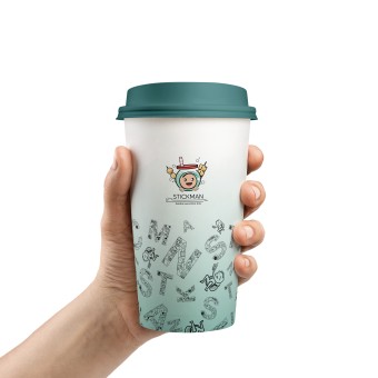
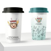
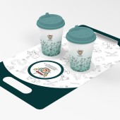
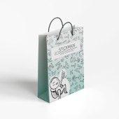
| DESIGN NAME: Stickman PRIMARY FUNCTION: Brand Design INSPIRATION: The inspiration for Stickman came from the desire to create a fun, approachable brand for all ages. The playful character and combination of bubble tea and skewer snacks represent the shop’s unique offerings. The design reflects Stickman’s mission of providing a warm, inclusive experience, symbolized by the mascot’s friendly expression. Local food trends and customer preferences were key to shaping the visual identity, ensuring it resonates with Kansas City’s diverse audience. UNIQUE PROPERTIES / PROJECT DESCRIPTION: Stickman, a bubble tea shop in Kansas City, opened in May 2024 with the slogan "bubble tea and stick bite." It quickly gained popularity for its cute brand design, high-quality tea, and snacks. The shop’s warm, inclusive service caters to all age groups, earning a 4.8/5 on Google reviews. Stickman’s visually engaging branding and customer-centric experience have attracted attention from local food media and influencers, establishing it as a key player in Kansas City's food scene. OPERATION / FLOW / INTERACTION: The Stickman brand creates a seamless interaction between the customer and the shop identity. The friendly mascot and visuals immediately catch attention, making the experience fun and memorable. The consistent design across banners, signs, packaging, and uniforms enhances brand recognition. Customers easily associate the playful visuals with the shops high-quality service, creating a welcoming atmosphere that improves overall customer satisfaction. PROJECT DURATION AND LOCATION: The project was done within 8 months and was launched officially in May 2024. FITS BEST INTO CATEGORY: Packaging Design |
PRODUCTION / REALIZATION TECHNOLOGY: The Stickman brand was created using digital illustration and vector design in Adobe Illustrator, ensuring scalability for various applications. The design process involved research into local food trends and customer preferences to align the visuals with the target audience. Emphasis was placed on a playful yet clean aesthetic, ensuring versatility across digital platforms, print media, and physical signage. SPECIFICATIONS / TECHNICAL PROPERTIES: The Stickman brand design is applied on various in-store and promotional assets, including a 12 ft x 4 ft banner, 12 ft x 6 ft LED business sign, and printed materials such as aprons, curtains, cups, straws, and delivery bags. Materials used include metal, fabric, and polypropylene. The design is scalable, ensuring consistency and clarity across both physical products and digital platforms. TAGS: branding, shop, packaging design, illustration RESEARCH ABSTRACT: The research focused on local food trends, especially snack shops and tea places. Objectives included understanding customer preferences through interviews with various age groups and a 1 on 1 interview with the store owner to align the design with their expectations. Data collected informed the brand and customer service. The shop achieved a 4.8 out of 5 Google rating and highly recommended on Yelp, demonstrating the brands success in creating a memorable and diverse customer experience. CHALLENGE: The challenge was designing a brand that reflected Kansas City diverse cultural and economic landscape. While the city is known for its agricultural roots, it also has a growing multicultural food scene. Balancing this with the shop identity was key. Researching customer preferences across age groups ensured the brand resonated with the community diversity. ADDED DATE: 2024-09-20 14:35:13 TEAM MEMBERS (1) : IMAGE CREDITS: Image: Yitian Zeng, 2024. |
||||
| Visit the following page to learn more: https://rb.gy/dlr9fv | |||||
| AWARD DETAILS | |
 |
Stickman Brand Design by Yitian Zeng is Winner in Packaging Design Category, 2024 - 2025.· Read the interview with designer Yitian Zeng for design Stickman here.· Press Members: Login or Register to request an exclusive interview with Yitian Zeng. · Click here to register inorder to view the profile and other works by Yitian Zeng. |
| SOCIAL |
| + Add to Likes / Favorites | Send to My Email | Comment | Testimonials | View Press-Release | Press Kit |
Did you like Yitian Zeng's Packaging Design?
You will most likely enjoy other award winning packaging design as well.
Click here to view more Award Winning Packaging Design.


