Aokmag Nutritionals Packaging by Hangzhou Juici Brand Design Co., Ltd |
Home > Winners > #163863 |
 |
|
||||
| DESIGN DETAILS | |||||
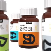
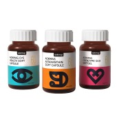
| DESIGN NAME: Aokmag Nutritionals PRIMARY FUNCTION: Packaging INSPIRATION: To capture consumers' attention, the packaging uses abstract, each bottle variety features a flat, abstract icon to represent the specific body part it targets or its key ingredient. For instance, a liver icon is used for liver health coated tablets, and a heart icon symbolizes coenzyme Q10 softgels. Moreover, the colors with high saturation are incorporated to evoke a sense of joy among consumers and establish a recognizable signature for the brand in a competitive market. UNIQUE PROPERTIES / PROJECT DESCRIPTION: This nutritional dietary supplements packaging uses simple icons and different colors to intuitively convey the benefits and characteristics of each supplement, helping consumers quickly identify and select what they need. For a clear information hierarchy, diverse vibrant color blocks are used as the backgrounds of different icons, with bold lines that make the key information stand out. This design achieves efficient information conveyance and enhance the overall attractiveness of the product OPERATION / FLOW / INTERACTION: 1.The key information of each supplement is efficiently conveyed with intuitive icons, helping consumers quick identify what they need. The ridged design on the cap enhances friction, making it easy to open even for older people. PROJECT DURATION AND LOCATION: Its design and development stated in Hangzhou, in Jun, 2023, and it was introduced to the Chinese market in October, 2023. FITS BEST INTO CATEGORY: Packaging Design |
PRODUCTION / REALIZATION TECHNOLOGY: 1.The dark bottle provides an ideal environment for preserving the nutritional dietary supplements, effectively protecting the active ingredients from light degradation. The bottle label is made by repulping and deinking recycled paper. This approach transforms waste into a green material, greatly reducing wood consumption. It responds to the modern call for sustainable development. SPECIFICATIONS / TECHNICAL PROPERTIES: product dimensions, 60 mm x 60 mm x 110 mm TAGS: Nutrition packaging, Flat icons, Color blocks for partitioning, Quickly identification, Information conveyance RESEARCH ABSTRACT: Traditional nutritional supplements packaging overemphasizes functional descriptions, preferring detailed text or realistic icons to illustrate ingredients or efficacy. This design breaks away from monotony. Each bottle variety features a minimalist flat icon, such as an eye, a heart, a liver, a bone or a shrimp, to represent the specific body part it targets or its key ingredient. This approach creates a unique visual identity, and helps consumers easily identify and choose what they need. CHALLENGE: The main challenge in this design was to help consumers quickly and accurately identify and understand all key information. To this end, the packaging utilizes vibrant color blocks to separate icons from text, ensuring that the key graphical elements stand out. Furthermore, the thickness of the elements gradually decreases from icons to product names and to dosage numbers, naturally guiding the focus of consumers throughout a clear information hierarchy. ADDED DATE: 2024-09-03 01:46:26 TEAM MEMBERS (1) : Frank Zhu, David Wang IMAGE CREDITS: Hangzhou Juici Brand Design Co., Ltd, 2024. |
||||
| Visit the following page to learn more: https://www.juici.cn/ | |||||
| AWARD DETAILS | |
 |
Aokmag Nutritionals Packaging by Hangzhou Juici Brand Design Co., Ltd is Winner in Packaging Design Category, 2024 - 2025.· Read the interview with designer Hangzhou Juici Brand Design Co., Ltd for design Aokmag Nutritionals here.· Press Members: Login or Register to request an exclusive interview with Hangzhou Juici Brand Design Co., Ltd. · Click here to register inorder to view the profile and other works by Hangzhou Juici Brand Design Co., Ltd. |
| SOCIAL |
| + Add to Likes / Favorites | Send to My Email | Comment | Testimonials | View Press-Release | Press Kit |
Did you like Hangzhou Juici Brand Design Co., Ltd's Packaging Design?
You will most likely enjoy other award winning packaging design as well.
Click here to view more Award Winning Packaging Design.


