Five Minutes to the End of the World Book by Aleksandra Toborowicz |
Home > |
 |
|
||||
| DESIGN DETAILS | |||||
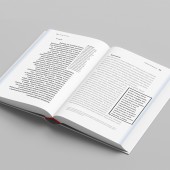
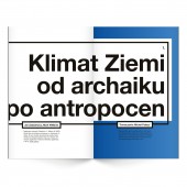
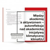
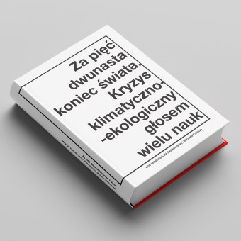
| DESIGN NAME: Five Minutes to the End of the World PRIMARY FUNCTION: Book INSPIRATION: The key words that describe the subject of the publication "Five Minutes to the End of the World: The Climate-Ecological Crisis is the Voice of Multiple Sciences" are ecology, climate threat, and warning. In terms of the graphic concept, the creator decided to depart from the conventional association of green with ecological themes. Instead, they opted for contrasting and warning tones to better reflect the gravity of the issue. Despite the possibility of presenting the problem in a positive and encouraging manner, the choice was made to adopt a more decisive and alarming approach in line with the publication's title – "Five Minutes to the End of the World." This title conveys the urgency of the situation, suggesting that there is little time left to act. Therefore, the focus was on delivering a strong message. The color palette was deliberately limited to black typography, which starkly contrasts with shades ranging from navy blue to burgundy. These colors were chosen to symbolize the increase in global temperatures, reinforcing the severity of the climate crisis. UNIQUE PROPERTIES / PROJECT DESCRIPTION: The publication was divided into three parts and 21 chapters. Its composition and layout are characterized by a minimalist form, sometimes bordering on austerity, aiming to eliminate unnecessary ornamentation. Excerpts with slogans and sentences requiring special emphasis were utilized in the text, prompting the inclusion of black frames reminiscent of uncompromising warnings. These frames are combined with a bold sans-serif script, evoking the characteristic warnings found on tobacco products. In terms of colors and inspirations, a palette referencing changes in global temperatures was chosen. This palette draws inspiration from the "Warming Stripes" concept pioneered by climatologist Ed Hawkins, illustrating the Earth's increasing temperature. Hawkins' concept, which gained widespread attention in 2018 and inspired the hashtag #ShowYourStripes, served as the basis for the color assignment to the chapters. The colors transition from cooler hues symbolizing lower temperatures to warmer shades representing global warming. Additionally, each chapter opening features an underprint with a tonal transition connecting adjacent chapter colors, facilitating navigation. Furthermore, narrow vertical strips of color gradient corresponding to each chapter are placed on the edges (bleed) of each page for enhanced navigation. The spine of the publication, spanning 5 cm, ensures that the graphics remain perfectly visible despite its extensive 844 pages. Furthermore, as the publication is leafed through, the graphics animate, providing an interactive element to the reading experience. Regarding typography, the chapter titles deliberately deviate from the standard size and layout, spanning two spreads each time. This intentional departure, varying in style and size, is inspired by violent and unpredictable natural phenomena. It serves as a deliberate disruption of the conventional typographic system, adding depth and intrigue to the design. OPERATION / FLOW / INTERACTION: - PROJECT DURATION AND LOCATION: Kraków, Poland |
PRODUCTION / REALIZATION TECHNOLOGY: Publisher: Jagiellonian University in Krakow, Jagiellonian Library ISBN: 978-83-67127-12-7 SPECIFICATIONS / TECHNICAL PROPERTIES: number of pages: 844 format: 154 mm × 238 mm edition: electronic TAGS: ecology, climate threat, warning, temperature, minimalism RESEARCH ABSTRACT: The publication was divided into 3 parts, consisting of a total of 21 chapters written by people associated with, among others, with the Science for Nature portal, the Jagiellonian University Climate Council and the Anthropocene Working Group. In order to better understand the terminology accompanying the publication, an extensive "Climate-Ecolog CHALLENGE: While a strong message is crucial, it is frequently overlooked by society. People have become accustomed to warnings and have ceased to respond to them, much like in the case of threats associated with addiction or health. Here, I draw an analogy to the lack of response to climate change, which is currently unfolding and demands immediate action. ADDED DATE: 2024-03-14 16:06:13 TEAM MEMBERS (1) : scientific editor: Kasia Jasikowska and Michał Pałasz IMAGE CREDITS: Aleksandra Toborowicz , 2023. |
||||
| Visit the following page to learn more: https://www.behance.net/gallery/17731850 |
|||||
| AWARD DETAILS | |
 |
Five Minutes to The End of The World Book by Aleksandra Toborowicz is Runner-up for A' Design Award in Print and Published Media Design Category, 2023 - 2024.· Read the interview with designer Aleksandra Toborowicz for design Five Minutes to the End of the World here.· Press Members: Login or Register to request an exclusive interview with Aleksandra Toborowicz . · Click here to register inorder to view the profile and other works by Aleksandra Toborowicz . |
| SOCIAL |
| + Add to Likes / Favorites | Send to My Email | Comment | Testimonials |


