Moonshot Bar Exhibition Booth by Takeshi Yoshida |
Home > |
 |
|
||||
| DESIGN DETAILS | |||||
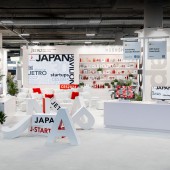
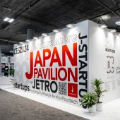
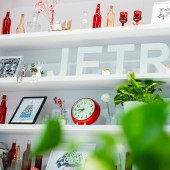
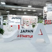
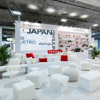
| DESIGN NAME: Moonshot Bar PRIMARY FUNCTION: Exhibition Booth INSPIRATION: This design is for the Japan Pavilion at the CES 2024, one of the largest technology conventions in the glove. The design should make visitors feel the uniqueness of Japan. It is inspired from simplicity and minimization, the fundamental concept of Zen, which Japan has always been with since ancient times. UNIQUE PROPERTIES / PROJECT DESCRIPTION: The uniqueness of this space is creating organized chaos, which means chaotic multiple attractions carefully placed in one small space, though it’s an almost impossible mission. There are 5 attractions, which are exhibition tables, an information counter, a bar, a lounge and mingle space, and an event space with a large video display. Event space makes visitors to enter this space, then interaction and conversation starts at a bar and lounge. Also, lots of green is used in this space, showing the eco-friendly attitude, reducing waste from exhibition, and creating a cozy atmosphere. OPERATION / FLOW / INTERACTION: Unlike the normal exhibition booth in a convention, visitors enjoy drinks and conversation in a cozy mingling lounge and bar, which we named Moonshot Bar. The name is decided in the hope that moonshot, in other words, giant leap will come out from this space. One of the best ways to achieve the goal, appealing products and services to the world, is to create a space that would generate more conversation and interaction between exhibitors and attendees. The more conversation and communication would eventually lead to the realization of the goal, creating a giant leap. PROJECT DURATION AND LOCATION: The project started in August 2023 in San Francisco and Tokyo, and finished in January 2024 in Las Vegas, and was exhibited in the largest technology themed convention in the globe, CES 2024 in January 2024. FITS BEST INTO CATEGORY: Interior Space and Exhibition Design |
PRODUCTION / REALIZATION TECHNOLOGY: Transparency and spaciousness is the most important aspect to get visitors’ attention as the ceiling of the venue is very low. Therefore, the design focuses on keeping the exhibition table height low and not using many walls. Visitors can appreciate the unblocked view from one end to the other in this space. In addition, in a technology themed convention, most booths use cold white lighting since the color of cold white might remind people of technology, however, this space intentionally uses warm white lighting and green plants to attract people and create a cozy atmosphere of a bar. SPECIFICATIONS / TECHNICAL PROPERTIES: The booth area is 60 feet x 50 feet. In other words, 18,288 mm x 15,240 mm. TAGS: Zen, minimization, transparency, spaciousness, simplicity, exhibition design, convention, Japan, bar, green, RESEARCH ABSTRACT: In terms of design, creating more conversation and interaction in an exhibition booth is one of the biggest and important challenges because the communication between exhibitors and attendees could create new business. Literature review and field work by joining other major conventions all over the world has been done. The results dramatically have improved the design, production and realization such as using white warm color lighting, music, aroma oil and green, transparency and spaciousness. CHALLENGE: The biggest challenge is the height of the ceiling of the venue, which is very low and also the venue does not permit hanging from the ceiling, while hanging signs are one of the main tools to attract visitors. In this circumstance, transparency and spaciousness is the most important aspect to motivate visitors to come to this space. Therefore, the design focuses on not using many walls and keeping the exhibition table height low. People can appreciate the unblocked view from one end to the other in this space. In addition, all the exhibitor’s demo tables face the aisle and have pillars wrapped in a creative way. ADDED DATE: 2024-03-04 21:47:10 TEAM MEMBERS (1) : IMAGE CREDITS: Takeshi Yoshida, 2024. |
||||
| Visit the following page to learn more: https://bit.ly/3vywhHi | |||||
| SOCIAL |
| + Add to Likes / Favorites | Send to My Email | Comment | Testimonials | View Press-Release | Press Kit |
Did you like Takeshi Yoshida's Trade Show Design?
You will most likely enjoy other award winning trade show design as well.
Click here to view more Award Winning Trade Show Design.


